AOL AUTO GROUP, MOBILE WEB
BABY YOU CAN DRIVE MY CAR
BACKGROUND
Autoblog (autoblog.com) is an American internet-based automotive news and car shopping website that obsessively covers the auto industry. With 9.2 million visitors to the website each month, 10.9 million monthly unique views, and 89 million monthly page views, Autoblog is one of the top-tier destinations for industry news, car reviews, and vehicle shopping tools.
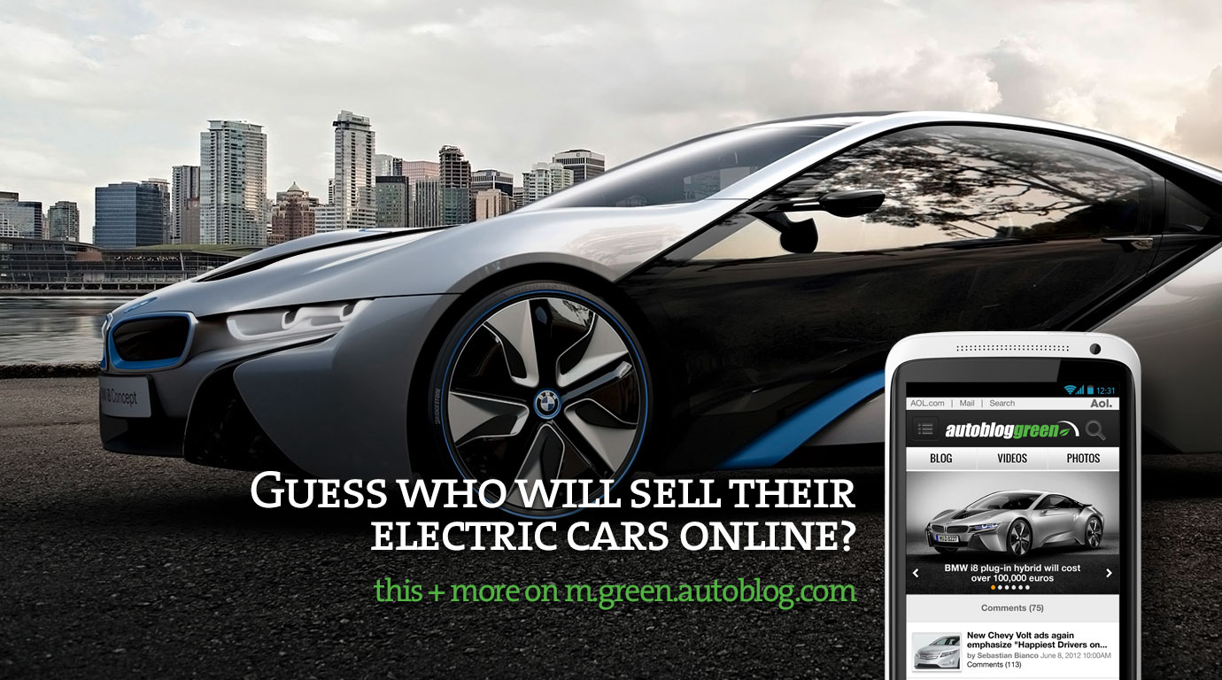
Autoblog-Green (green.autoblog.com) obsessively covers all environmentally friendly (or egregiously unfriendly) car news. Started on Earth Day 2006, it is part of the Weblogs, Inc. network of blogs and is closely affiliated with Autoblog.
Translogic (translogic.aolautos.com) is a fast, funny, and informative ride toward the future of transportation for people obsessed with how we get from A to B. A new video episode is posted every Monday.
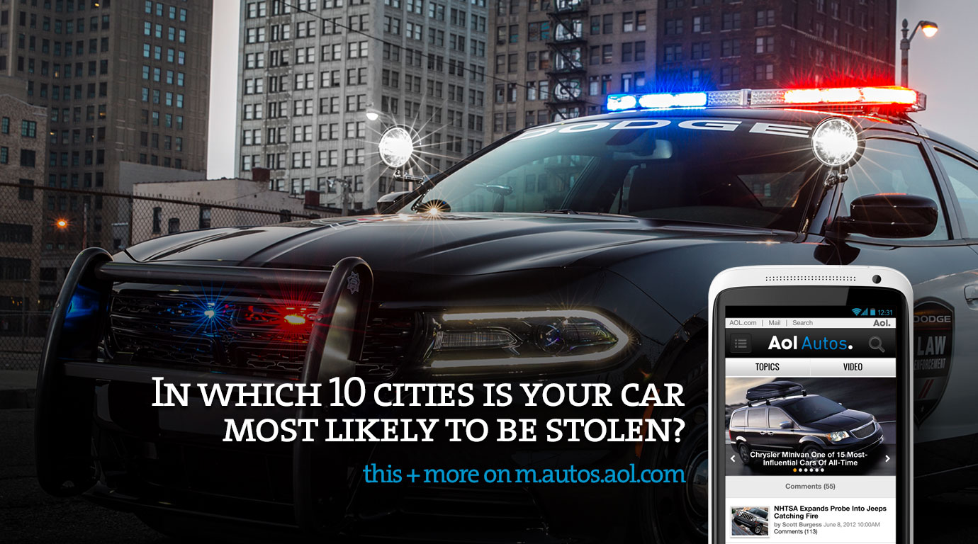
Aol Autos (autos.aol.com) offers tools for making smart car decisions, including researching, buying, repairing, or selling cars. The site also includes car news, articles, and stories.

WHAT IS AUTOBLOG?
"Collectively we're a staff of drivers, off-roaders, journalists, tech geeks, musicians, filmmakers and adventurers." With editorial offices in Birmingham, Michigan the members of AutoBlog are very serious about what they do.
THE CHALLENGE
I was asked to address the Auto Group's umbrella of brands and bring them to the mobile space ASAP. The online landscape was changing for the four brands. And while they knew responsive websites were the way to go, they needed their digital footprint up and running now, not a year from now. The challenge was twofold.
Phase I: Content sites launch by the end of Q2
Based on the kick-off date, we had just weeks to bring all four brands online.
Phase II: Research Tools sites launch by the end of Q3
Phase II was harder since it meant bringing all the tools for searching, researching, and buying new and used cars online in a mobile form factor — on the mobile web. This was to include, tentatively the Kelly Blue Book and advertising initiatives already in place on the existing desktop sites. The PRD was nothing if not ambitious.
As the sole designer on the mobile web experiences for the Autos Group, I had to work in conjunction with the desktop group to bring this vision to fruition while still staying within the parameters of a new mobile app they were concurrently building.
my role: UX-UI and Design
platforms, web content: iOS, Android, and degradation for Blackberry & Feature Phone
platforms, web research tools: iOS and Android ONLY
tools-processes: Stakeholder Interviews, Analytics Review, Market Research, Collaborative Whiteboarding

We mobilized all four brands AutoBlog, AutoBlog-Green, Translogic and Aol Autos in record time. Then we were asked to mobilize the car search and research experience — THIS would take more than a few weeks. The PRD was nothing if not ambitious. We would need to work fast. Essentially the entire project was a sprint.
THE WORK & ACTIONS TAKEN
Leveraging a process unofficially dubbed WebSpinner, we mobilized all four brands AutoBlog, AutoBlog-Green, Translogic and Aol Autos in record time, doing in weeks what used to take months. Easy, Peasy, Lemon Squeezy. Then we were asked to mobilize the car search and research experience — this would take more than a few weeks. In addition to the PRD, we had three major requirements to address.
ONE
PROBLEM: How will we maintain monetization on mobile web?
I had to maintain the existing ad spaces currently monetized on Aol Autos or provide alternative placements within the design. We also had to provide a way to extend our partnership with Toyota and the branded Choose Control feature.
SOLUTION: We maintained the same number of ad placements. We even introduced new opportunities for local dealership advertising.
Working with the ad team, we identified 10 opportunities for mobile ad placement. These ads would be pertinent to our users and their searches to provide real value. We had ad space parity even if the type/size of units changed.
300x130 and 374x140 Text Ads would be resized to fit the narrow columns on smartphones and provide meaningful results after a search for a specific make/model of car. These ads could also be placed above or below the initiate new search links at the end of every search result.
300x250 Ad units would be placed within vehicle details, leveraging localization and offering specific deals based on car model or promoting specific dealerships. This would appear within car comparison views and before/after the initiation of a new car search — as end caps.
Within the constraints of a mobile browser I designed an experience that supported the Toyota Choose Control feature. It was up to our marketing and dev team to decide if it would be fully implemented.
TOYOTA's CHOOSE CONTROL
Toyota's Choose Control (TCC) asked you to answer multiple choice questions about gender, family size, work and play. Based on your answers Choose Control would stitch together video snippets into a linear narrative and present it to you in a seamless, personalized video. It was revolutionary. In these videos Toyota provided their top two choices from their product line that were a best match for your lifestyle. These matches would supersede your search results much like paid ads in Google's search experience.
TWO
PROBLEM: How will we replicate all the content on desktop in our mobile web experience?
Readers hate when your mobile sites were truncated versions of the desktop site.
SOLUTION: Mobilize all the content most important to readers in our mobile web experience. Legal and administrative content was left in their original formats.
AUTOs CONTENT VIEWS
THREE
PROBLEM: How do we make the research tools experience on mobile web, truly useful?
I had to ensure our experience was useful in the field, especially on car lots where potential buyers were expecting realtime answers to queries about their next big purchase.
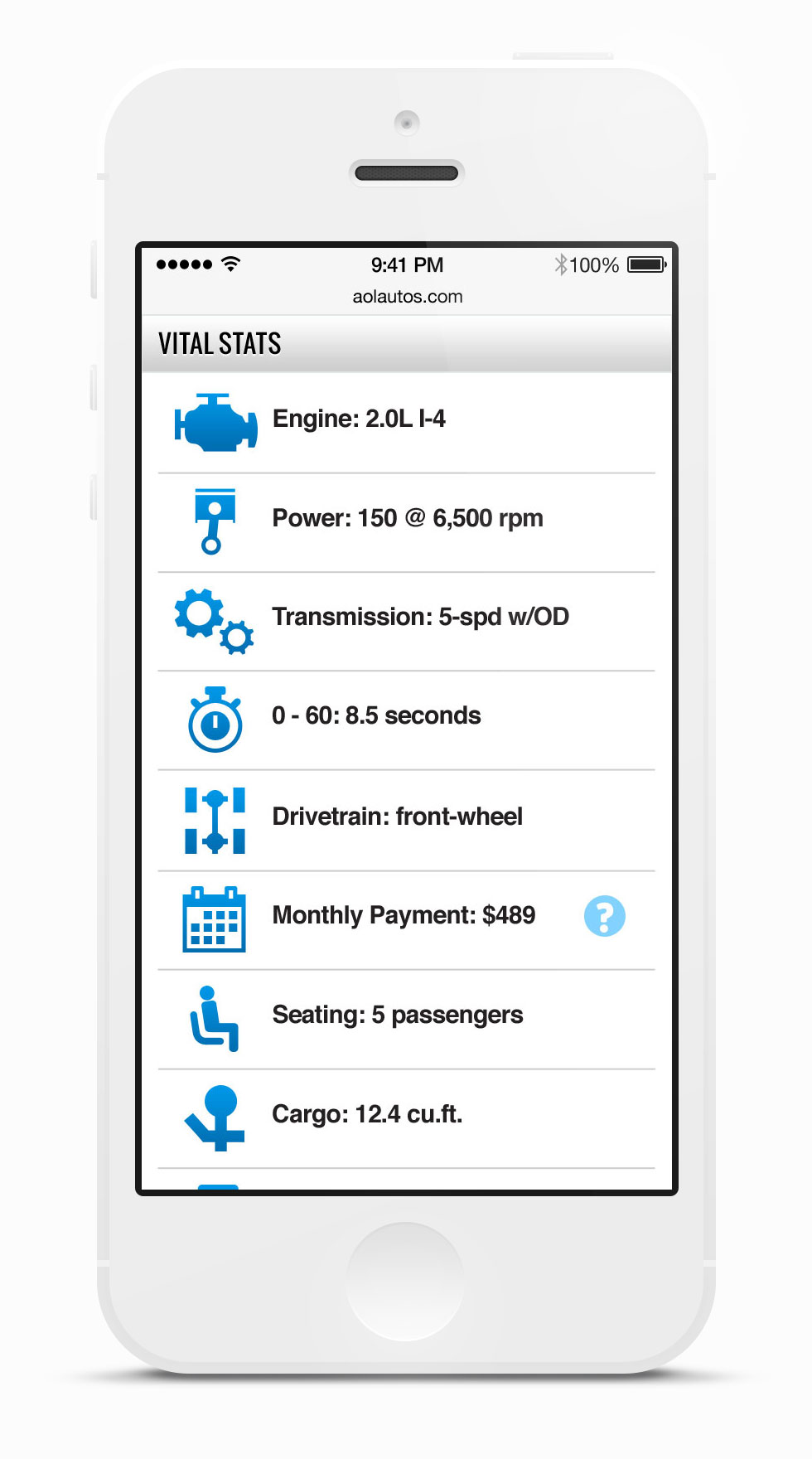
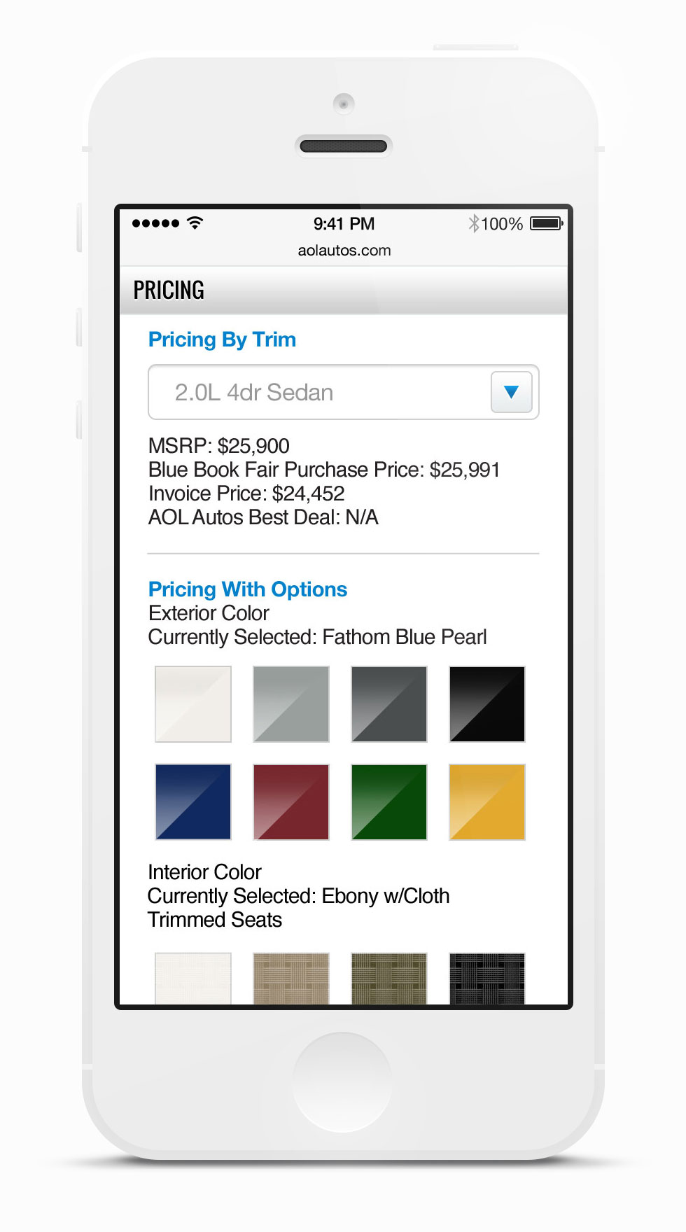
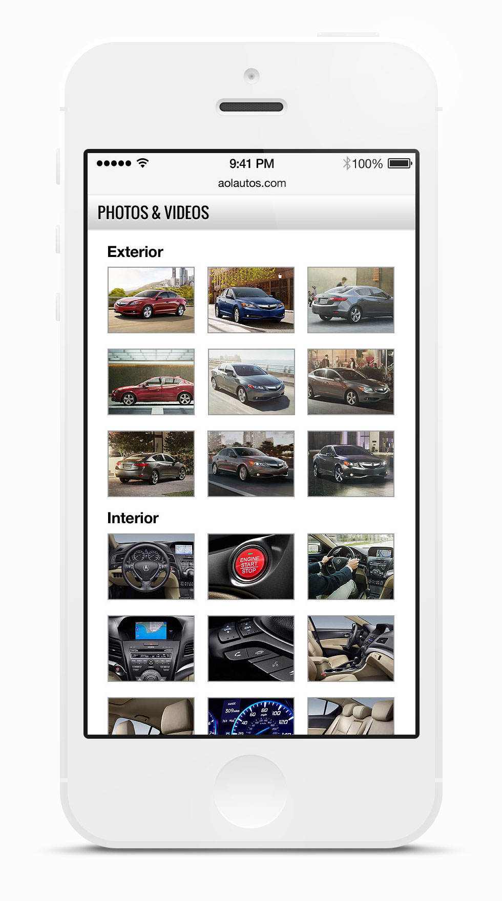
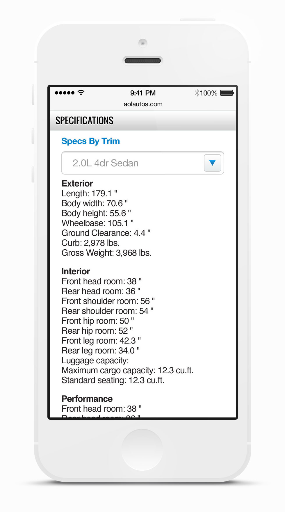
SOLUTION: We changed the form factor, and I changed the way data is visualized — making the research experience on the mobile web truly useful.
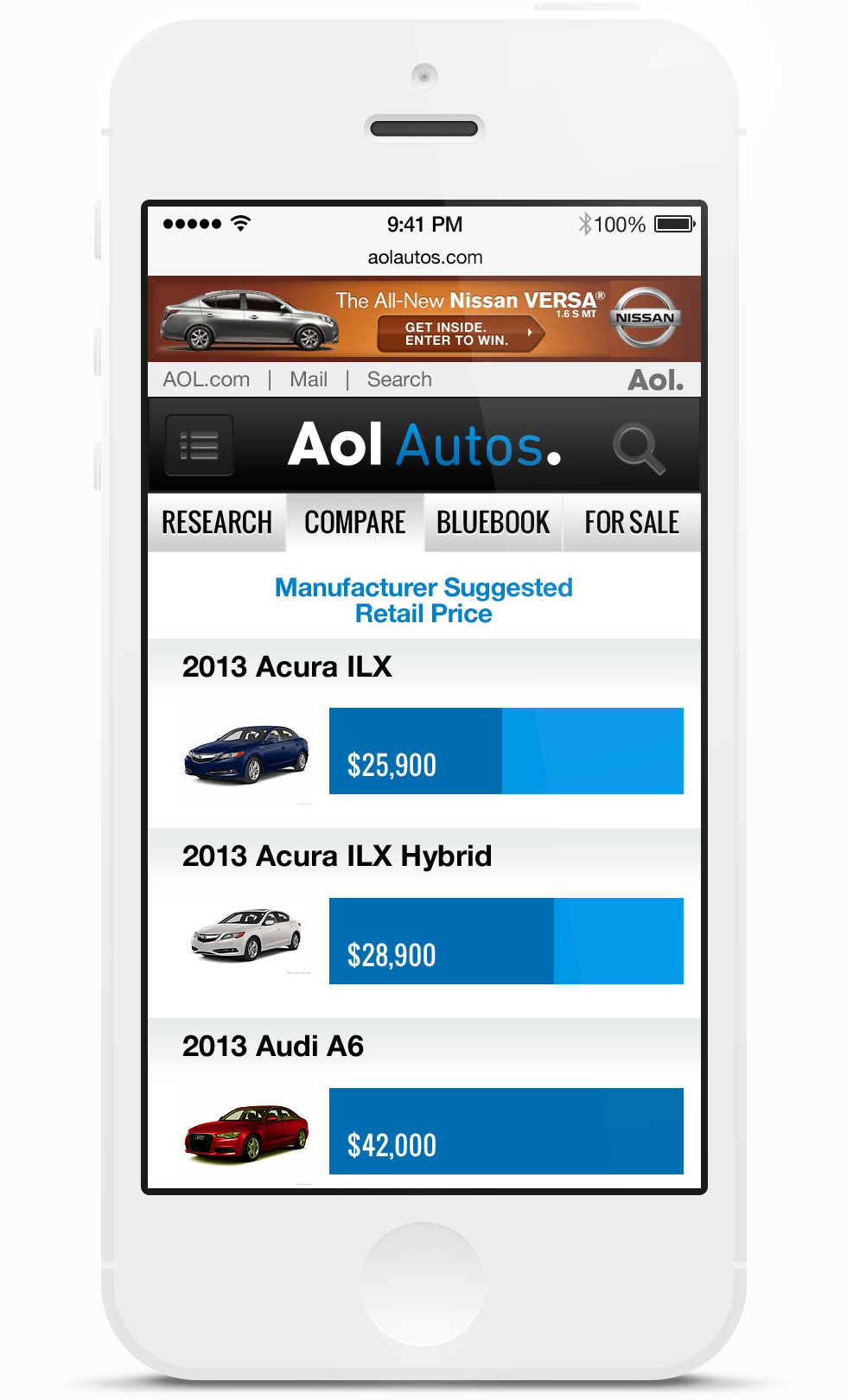
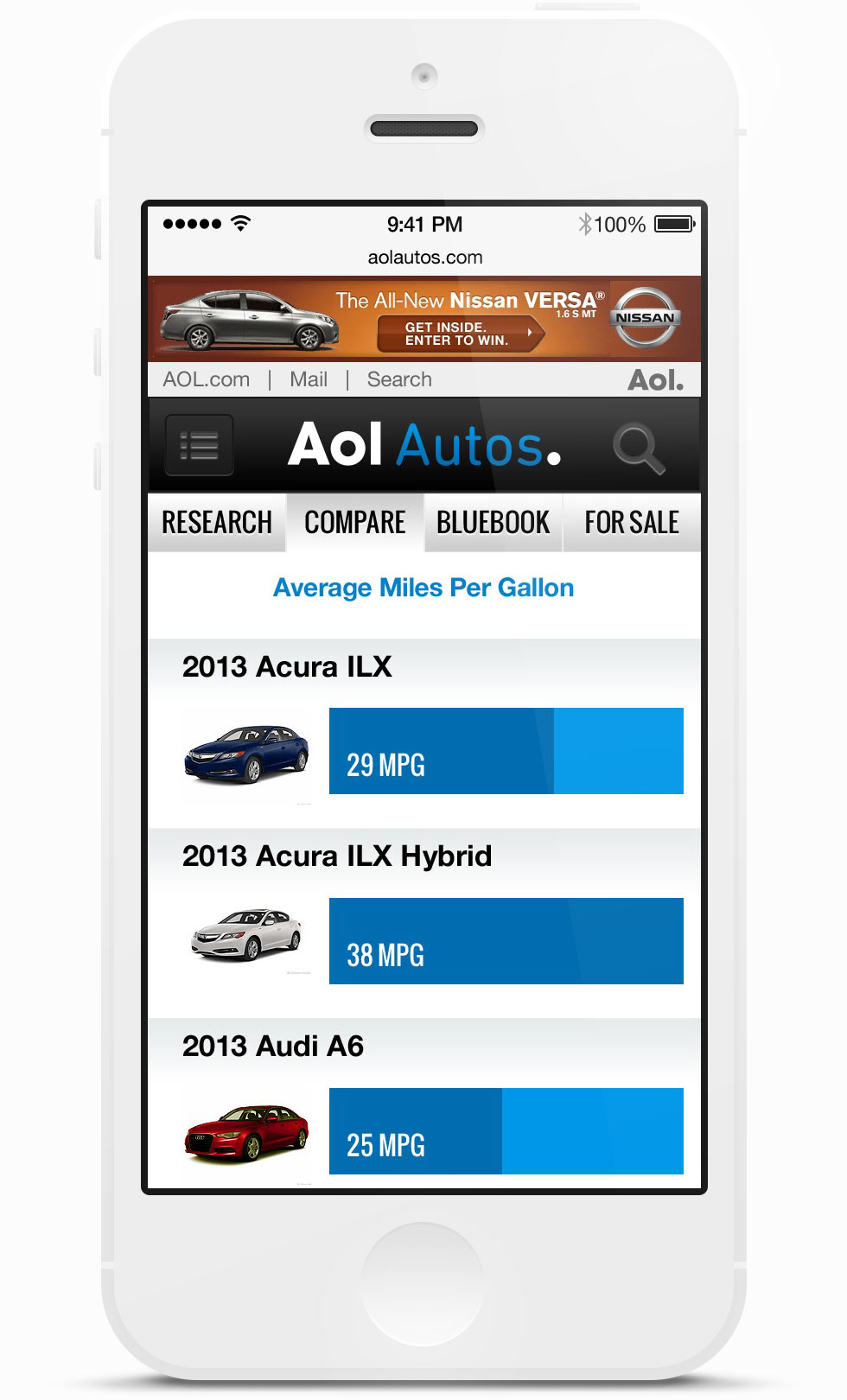
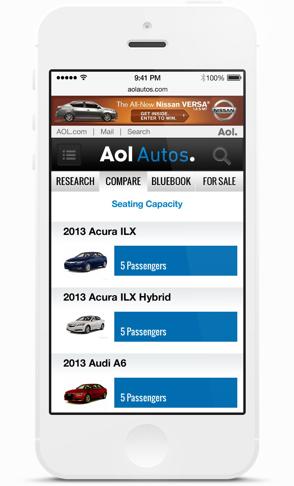
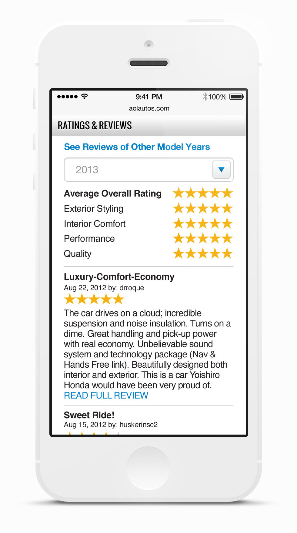
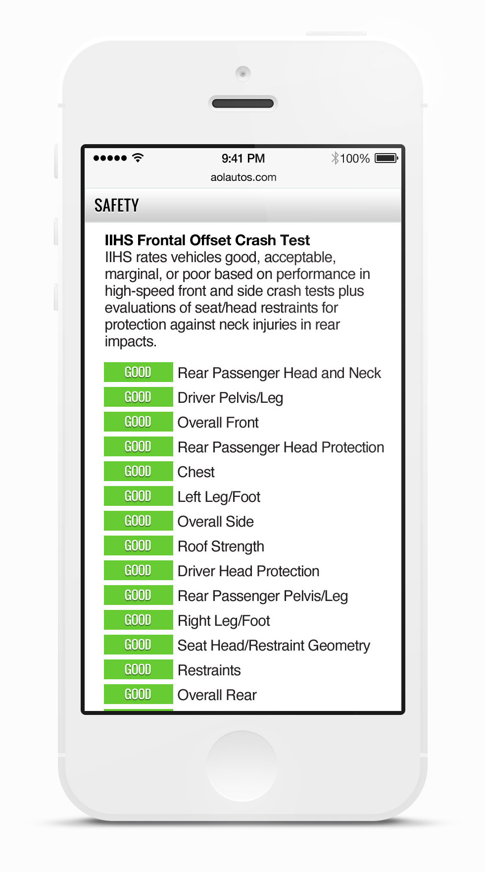
COMPARING VEHICLES
I introduced clear, simple data visualization and a swipe gesture to the compare experience so users could easily make sense of specifications at a glance. This would prove especially useful on the dealer car lot. See a scrollable preview.
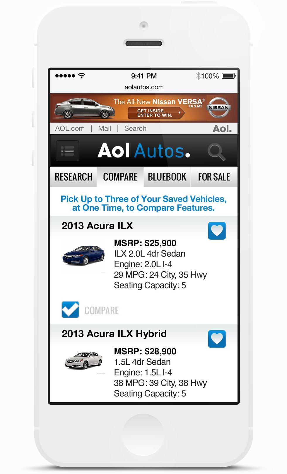
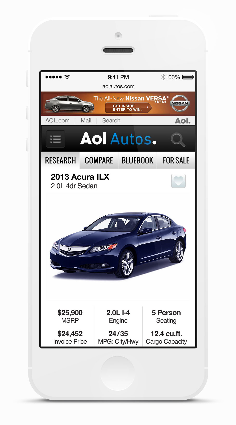
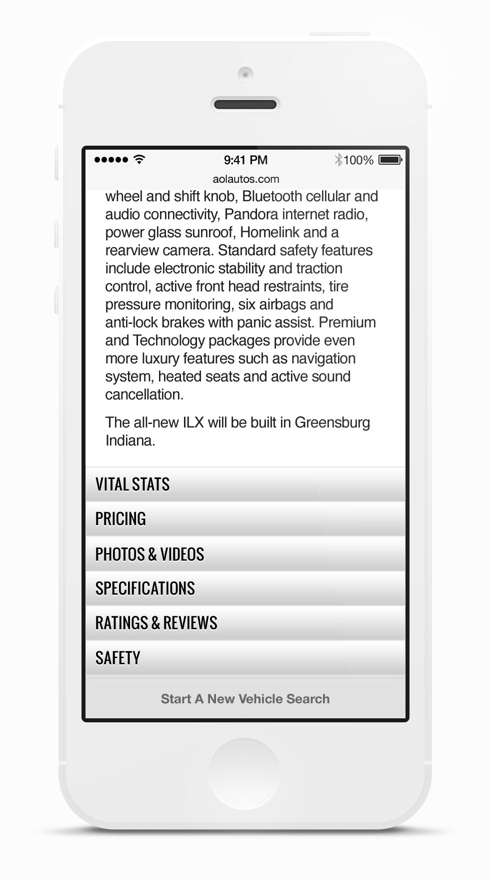
EXPANDING/COLLAPSING DETAIL PAGES
Sensitive to mobile download speeds, if the user had a weak cell signal, I designed the user experience so details relating to a chosen vehicle would load with all but the first section collapsed. The other sectional content would load in the background. Users would tap to open only the specific sections they were interested in.
ENHANCED WIREFRAMES & FLOW: Autos Content Site
On the content sites, we replicated unified flows across all the brands. Exceptions were made for brands with divergent content types.


ENHANCED WIREFRAMES & FLOW: Autos Research Tools
For research tools we kept flows consistent under the AolAutos umbrella. Specific flows had to be accommodated for new and used cars as well as Kelly Blue Book data.


SPECIFICATIONS & BEHAVIOR: Autos Research Tools
A cross section of hybrid specification docs.


RESULTS: AUTO BRANDS CONTENT WEBSITES
The Autos Group benefit from our expertise on the twenty plus brands we mobilized prior to this project. We leveraged all of our collective experience and brought the best of breed solutions from a process we had unofficially dubbed WebSpinner. The bug-free code behind evolved mobile photo galleries, mobile video players, and custom formatted content was married to our own gesture and swipe libraries. The shorthand developed between product, dev and UX/Design teams allowed us to launch bona fide versions of the four sites in weeks, not months.
RESULTS: AUTO BRANDS RESEARCH WEBSITE
As big of a lift as getting the Search, Research and Buying Tools designed for a mobile web user experience was, making sure it worked was a more significant lift. Our developers worked diligently to bring my designs and our collective visions to life.
I would be out of pocket* in Southeast Asia for over a month without a reliable internet connection, so I erred on the side of over-documentation. Wireframe flows, visual design, behavior, and specifications were all laid out as hybrid artifacts with redundant documentation.
Physical assets were cut for both retina and non-retina devices. The hand-off of the package was akin to Lego's Ultimate Collector’s Millennium Falcon. The desired result was that my documentation would be so complete if the developers had any questions they could easily find the answers. At the very least, they should be able to come to logical conclusions based on existing patterns. At the time, unlike apps running on Android or iOS, universally accepted and preexisting SDKs, HIGs, and fully fleshed-out bootstrap kits for mobile web did not exist.
We launched with New Cars as the primary focus. Kelly Blue Book features were added next, and Used Cars were dependent on back-end support since the sources for this data were numerous.
CONCLUSION & EPILOGUE
The most feared customer on a dealer car lot used to be the pipe-smoking, clipboard-carrying Dad with his earmarked copies of Consumer Reports.
Now, with smartphone ubiquity, we are all informed consumers. This is why the Autos team went with a mobile website rather than a mobile app. We'd plan and develop apps like My Garage in the future, but in this case, speed to market was paramount. The web platform was more forgiving and allowed us to address iOS and Android simultaneously. We wanted to arm our readers with the best tools possible to make the second-biggest purchase of their lives.
Autoblog became a juggernaut, the umbrella brand for the other Auto Group properties. Today, when you initiate a new car search at aolautos.com, you are redirected to AutoBlog's research, buying, and ownership tools.
*All work and no play makes Monirom a dull boy.