TROVE + THE FUTURE of NEWS
DON'T BELIEVE EVERYTHING YOU READ ON THE INTERNET
BACKGROUND
Trove was launched as a social news discovery and sharing app. It is available as a responsive web app and a mobile app for iOS, Android, and Amazon's Fire Phone.
Trove was engineered to exceed the track record of its highly successful predecessor, Social Reader — without relying on Facebook’s Open Graph.
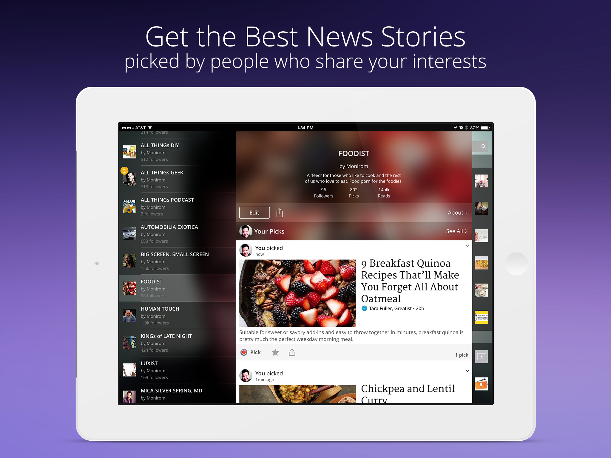
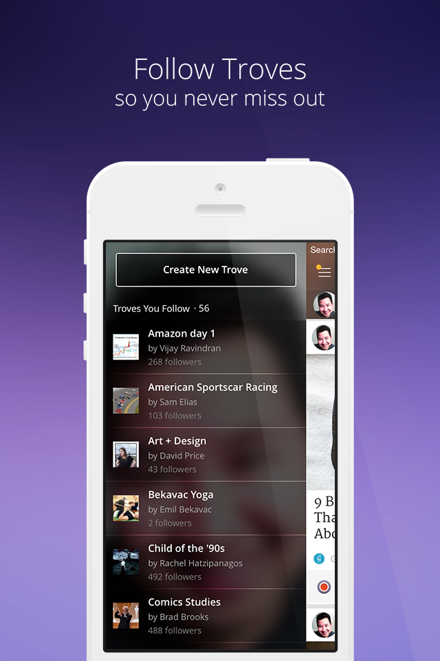
Users connected with experts and enthusiasts over shared topics. Users could curate personalized news feeds called troves based on their interests. Proactive Trove users picked the best stories to share with their followers. Users who only wanted to read could follow topical troves to see those picks in their home page feed.
Each topical trove was crafted through a powerful combination of AI, human knowledge, and passion.
Additionally, a team of editors evaluated the 15,000 new sources and 43,000 feeds for quality, and those sources fed the troves. An algorithm continuously ranked each trove's stories based on authority and timeliness.
Trove gave users the power to:
control what they want to read, see and hear
choose the news you want to read
pick the news you want to share
inject outside content to augment vetted in-app sources
Users could create general topic troves, but Trove truly shined when the topic was niche-focused on a specific person, place, or thing.


THE CHALLENGE
my role: Design Director, Product, UX-UI
charged with: Holistic product design, design management/oversight, and hands-on design.
platforms: Web, Phone and Tablet for iOS, Android, and the late Fire Phone
tools-processes: Various
The team behind Trove had prior experience building multiple successful products. However, the design team had been functioning without a Design Director for over six months. My challenge was to ensure that UX and design had a voice within the organization and that we communicated their benefits clearly.
My duties included overseeing and mentoring my charges, their careers, and all design within Trove—from branding to product. In the words of our CTO, “You were hired to bring the same level of polish, fit, finish, and UX of Engadget over to Trove.”
THE WORK / HOLISTIC ACTIONS
ETHOS
Global changes should be made only after understanding how an organization and its products function. This is especially true of any company or product with its own lexicon, e.g. the difference between a Trove and a trove. It was my job to win over the designers, gain the trust of the stakeholders, and reframe the role we played in product design. I was expected to perform triage on things that were not working. Incremental changes that would have immediate change took precedence over radical pivots.
DESIGNERS
Our work encompassed the whole cycle of design and not just the interactions. Thus, I changed the designers' titles to Product Designers. Weekly 1:1s were set-up and would occur outside the office when possible. Venting was encouraged as a form of catharsis. We focused not just on the work but on the designer'’ career trajectories. Conflict management was taught, as were lessons on effective communication in speech, writing, and presentation.
The designers understood that while they all had their specialties and focus, the products belonged to everyone at Trove. This made them more receptive to critique and open to collaboration inside and outside the design group.
A motivated design group is a productive design group.
ADVERTISING
Leveraging my past life in advertising and PR, I worked with the product group to boost our visibility's impact. With the product team, I designed everything from banner ads to social ads and all the needed components to unify our digital footprint. Internally and externally, sometimes with the help of our sister company, SocialCode, we refined the look, feel, content, and messaging of our ads based on performance.
What didn't work was pulled, and replacement options were rapidly deployed.

EMAIL COMMUNICATIONS
Trove generated no less than seven email products meant to solicit a specific response from our users.
Most recipients found the Daily Digest and Welcome emails helpful. The email team was relentless in analyzing our products' results. It would engage the design and editorial teams to suss out the edits and tweaks needed to maximize our communications.
Over time, we became more explicit with our design, timing, instructions, and visual cues so subscribers understood the purpose of each email. This increased our click-throughs and conversions and kept Trove fans from unsubscribing. The examples below compare the types of emails we sent out, but it's not an apples-to-apples comparison.


UX SOLUTIONS HIT LIST (a select cross-section)
While we had only four designers at Trove, I was no stranger to working with a deficit. It allowed us to wear many hats and leave our mark on all the facets of product design. The designers had a healthy mix of UX/UI, iOS design/dev skills, web design/dev skills, and user-testing experience; but each claimed a platform or main function as their specialty.
ANNUAL TOP 10 FIXES
Beyond our core directives, the design team kept a running list called The Top Ten Things I Would Fix—a personal hit list of functionality issues, pet peeves, UX debt, and polish. We chipped away at it throughout the year, weaving these fixes into more significant initiatives to keep the product evolving while making a real impact. The goal? I wanted to show our designers that progress doesn’t always require a massive overhaul. Small, constant improvements could move the needle. Call it a design polypectomy—clearing the clutter while keeping the momentum going.
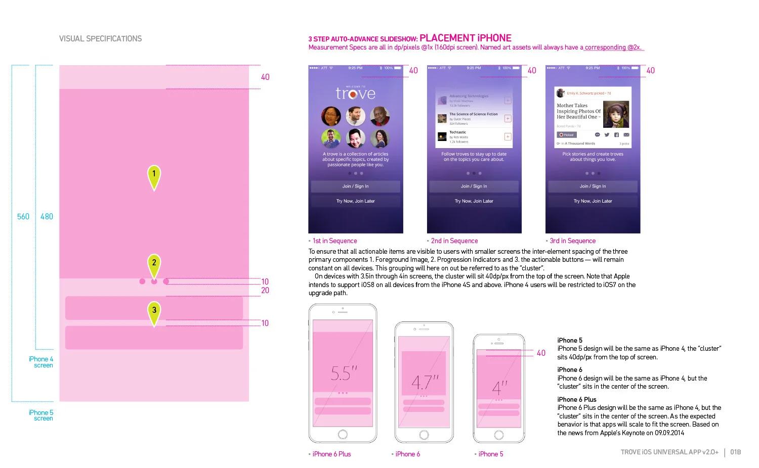
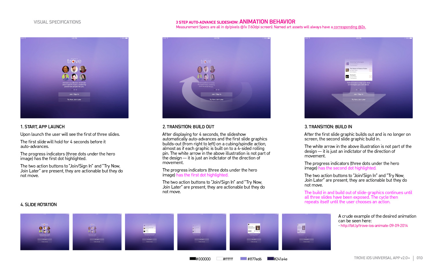
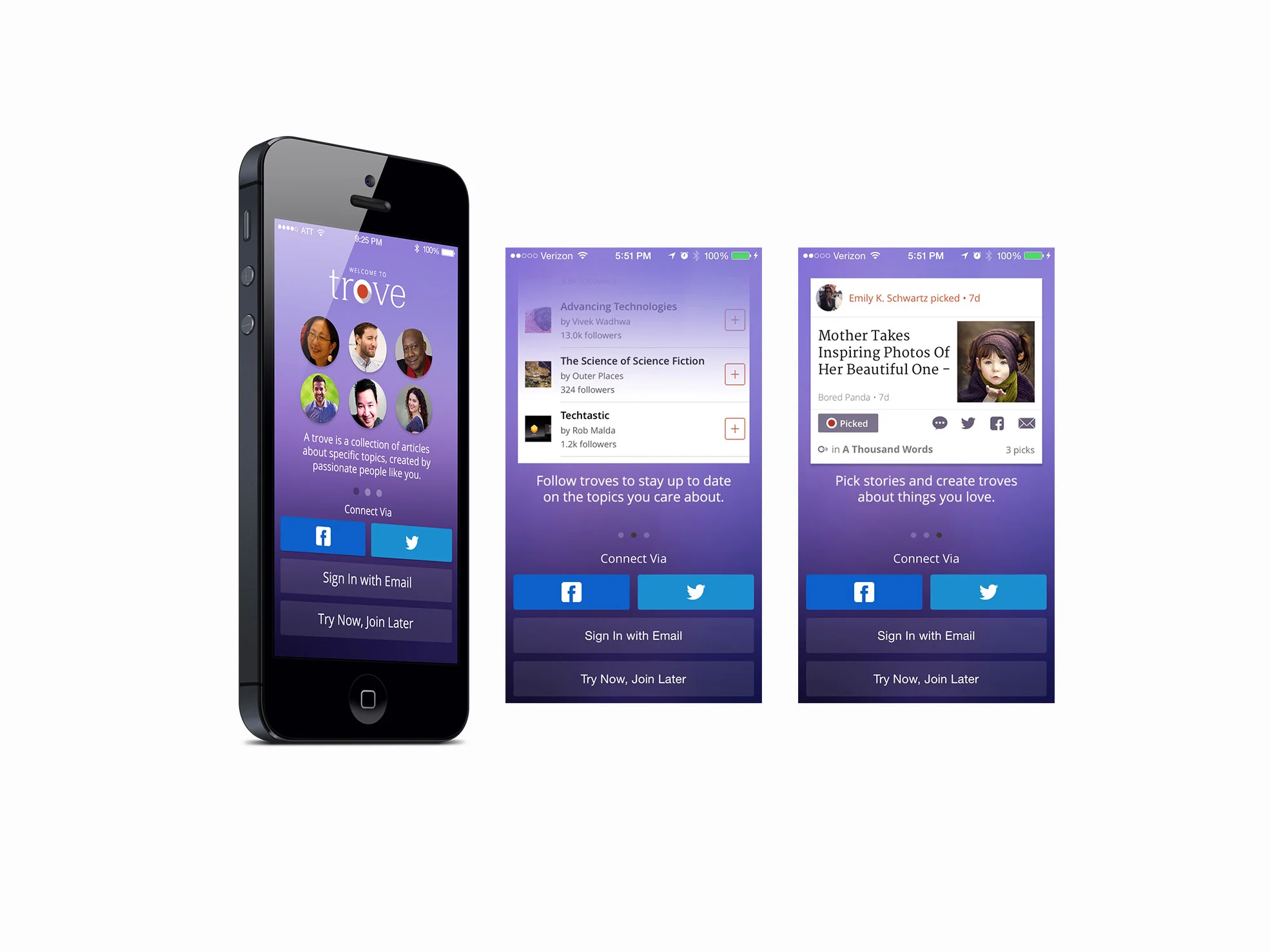
1. GETTING FIRST TIME USERS TO REGISTER (iOS)
Trove struggled with user registration. Force the first-time visitor to create an account without giving them a reason why, and you'll lose a potential new user. We had a bigger threshold to breach on the iOS app than the Web app. My first action as Design Director was to imbue the static sign-in screen with perceived value. We minimized choices and included a self-advancing animation explaining the benefits of signing up for Trove. Subsequent releases reintroduced social sign-in.
Below are the prototype animation and specifications given to our iOS dev team. Because half of our iOS dev team was overseas, I tended to overdocument.


. . . . .
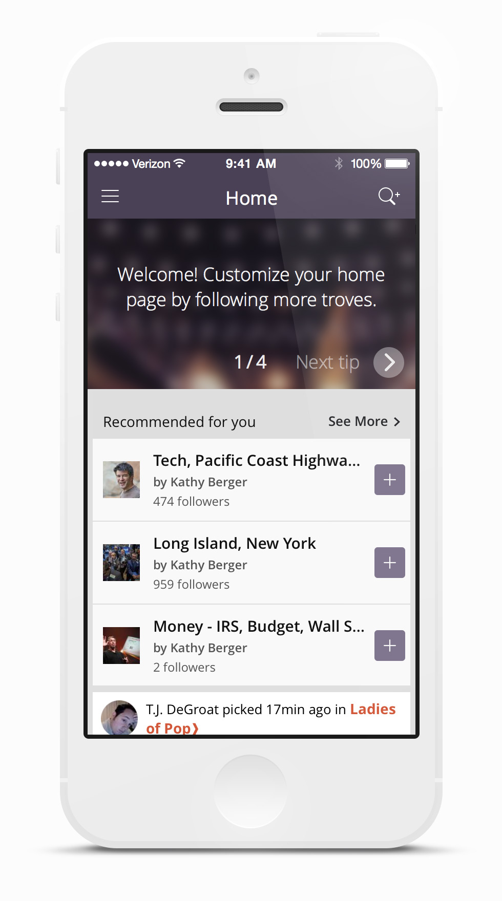
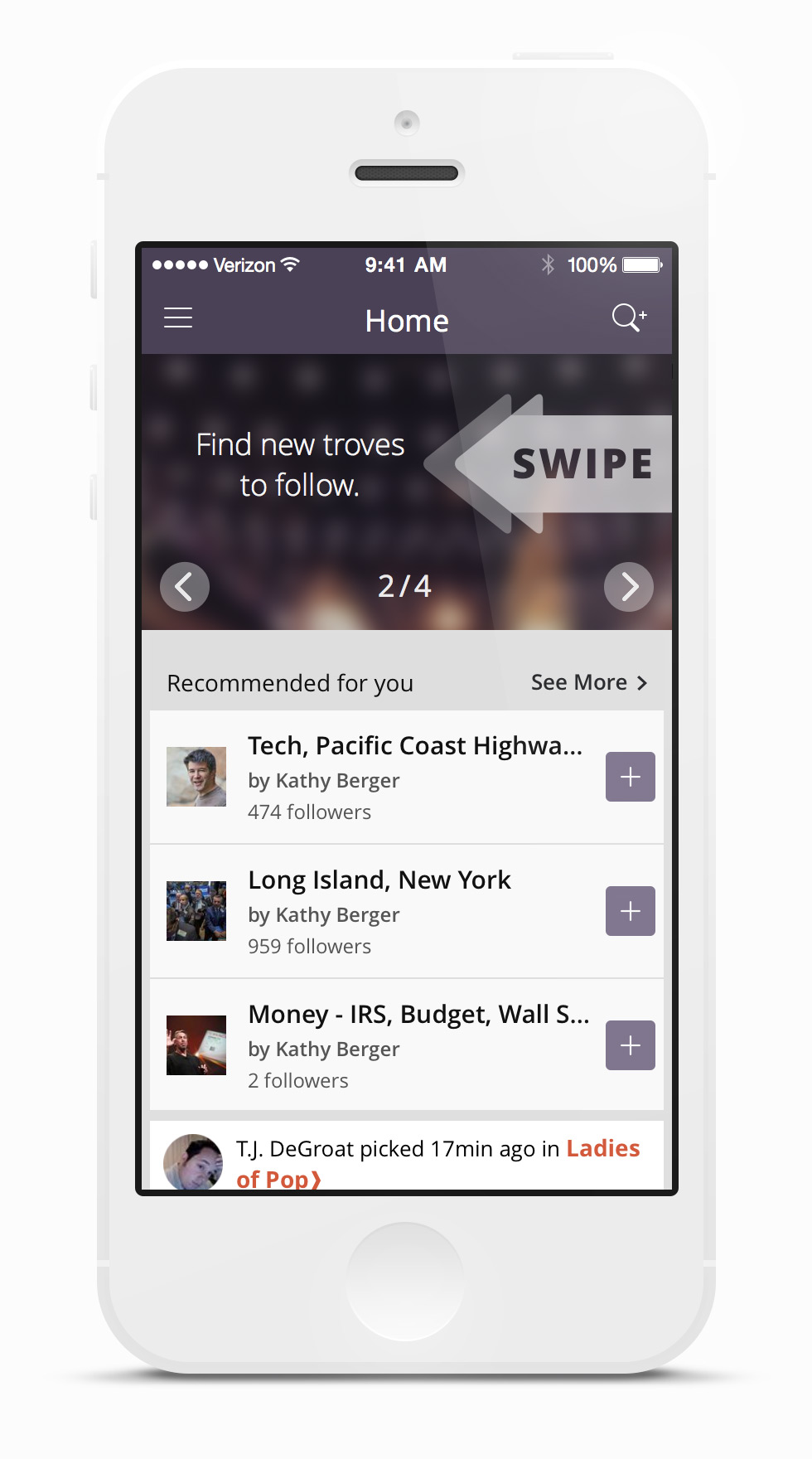
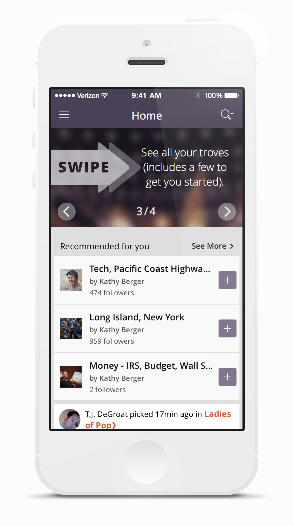
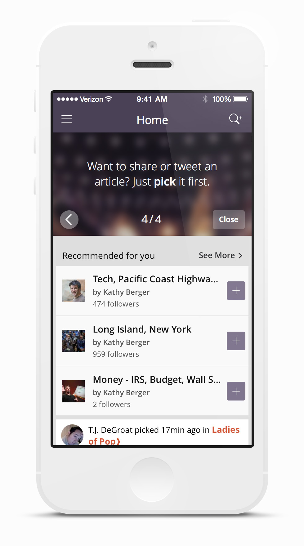
2. EDUCATING THE USER (iOS)
The second issue I attacked with my designers was the problem of user education.
We walked a fine line between getting in the user's way and not providing enough feedback when needed. As we streamlined registration, we also eliminated overlays and pop-ups.
We opted for a minimized tour that required user interaction to dismiss the hints. Original designs also included inline hints. The user could interact with these hints or scroll past them.
Either way, we didn't impede their progress in getting deeper into the app.
. . . . . .
If you use RSS and Google Alerts to follow topics, Trove could be a better solution.
~ The Verge
. . . . . .
The product's greatest strength comes from that curation concept.
~ The Washington Post
3. PICKMARKLET (Web App)
Originally developed for Trove's internal editorial team and power-curators, the Trove pickmarklet allowed users to add articles (outside the Trove apps) to their curated streams. It also served as a low-risk environment to test curation flows and a sandbox to try out new implementations of the Trove brand.

. . . . .
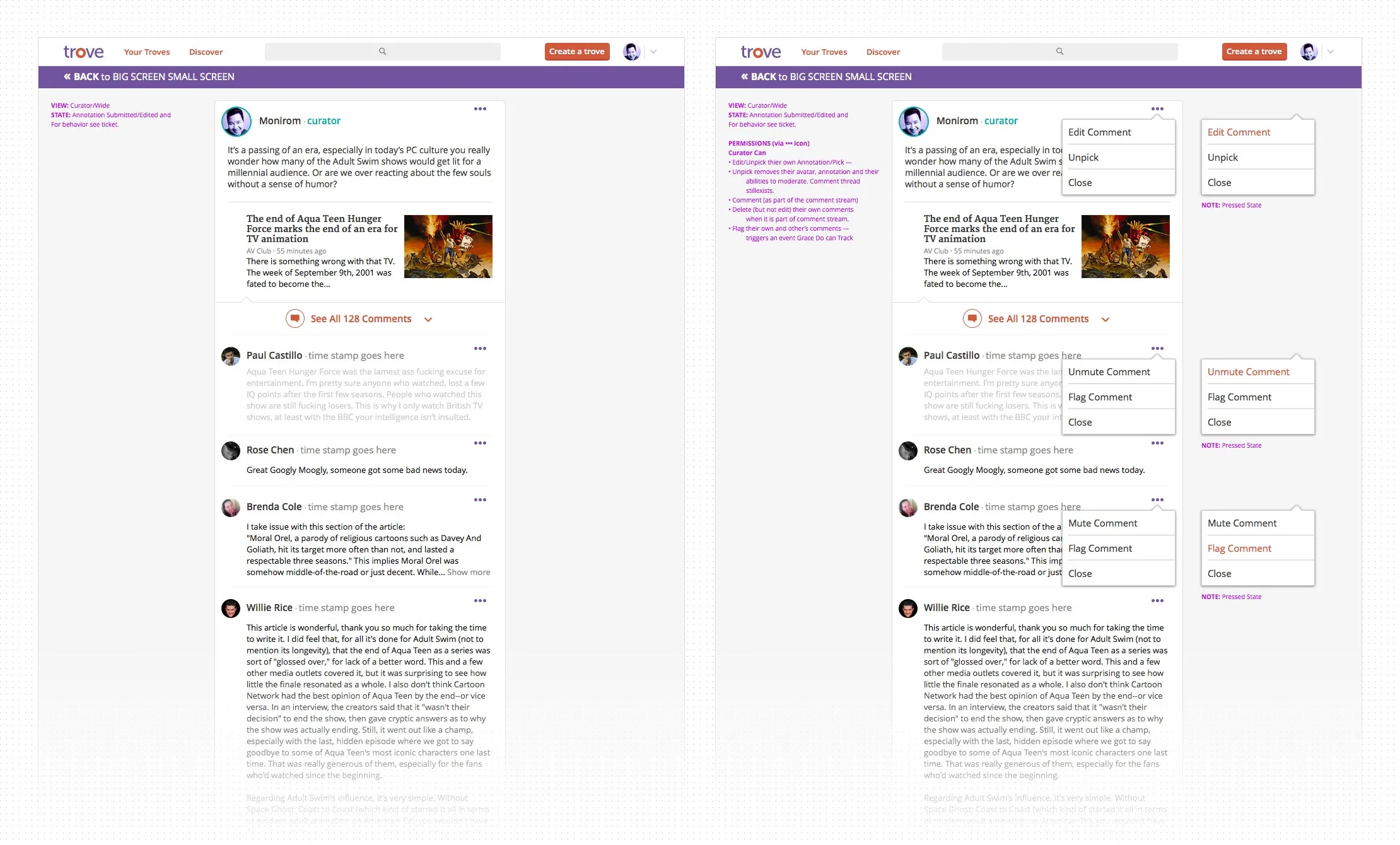
4. STARS and COMMENTS (iOS and Web App)
Adding Stars and Comments was the first major modification to the Trove product. We did it first on the web app, with iOS immediately following. In Trove, starring was a quick way for followers to provide validation to a trove's curator. It served as a virtual high-five or short hand for, "Thanks for picking this article, it resonates with me." The star animation was added to make the action more visceral and addictive. In addition to the animation, I insisted on an audio cue, which made it into the web app but not the iOS or Android UX.

. . . . .
5. CONVERSATIONS (iOS and Web App)
Our readership is skewed toward older users, who spent more time reading and were less likely to respond or tolerate clickbait. When we rolled out the comments feature, it generated more civil but still interesting conversations.


. . . . .
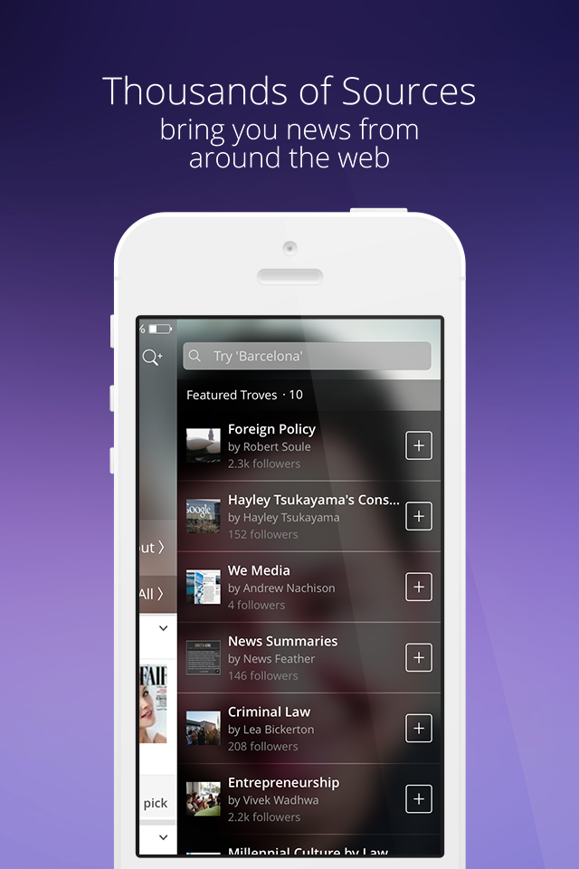
6. DISCOVER (iOS and Web App)
Several upgrades were made to improve the new user experience. From new ways to search and discover troves to an updated layout. New features included:
Articles organized by trove – culled from troves users curated, followed, or both
Popular troves – a selection of new and interesting troves worth following
Featured picks – our editors’ choice of the best-picked articles of the day
A Discover section was added to augment in-app search and exploration of new troves. It featured more active troves and editorial staff picks. We started with simple discovery cards. We'd have the option to upgrade the designs after we received performance data and had given the curators personalization features.


. . . . .
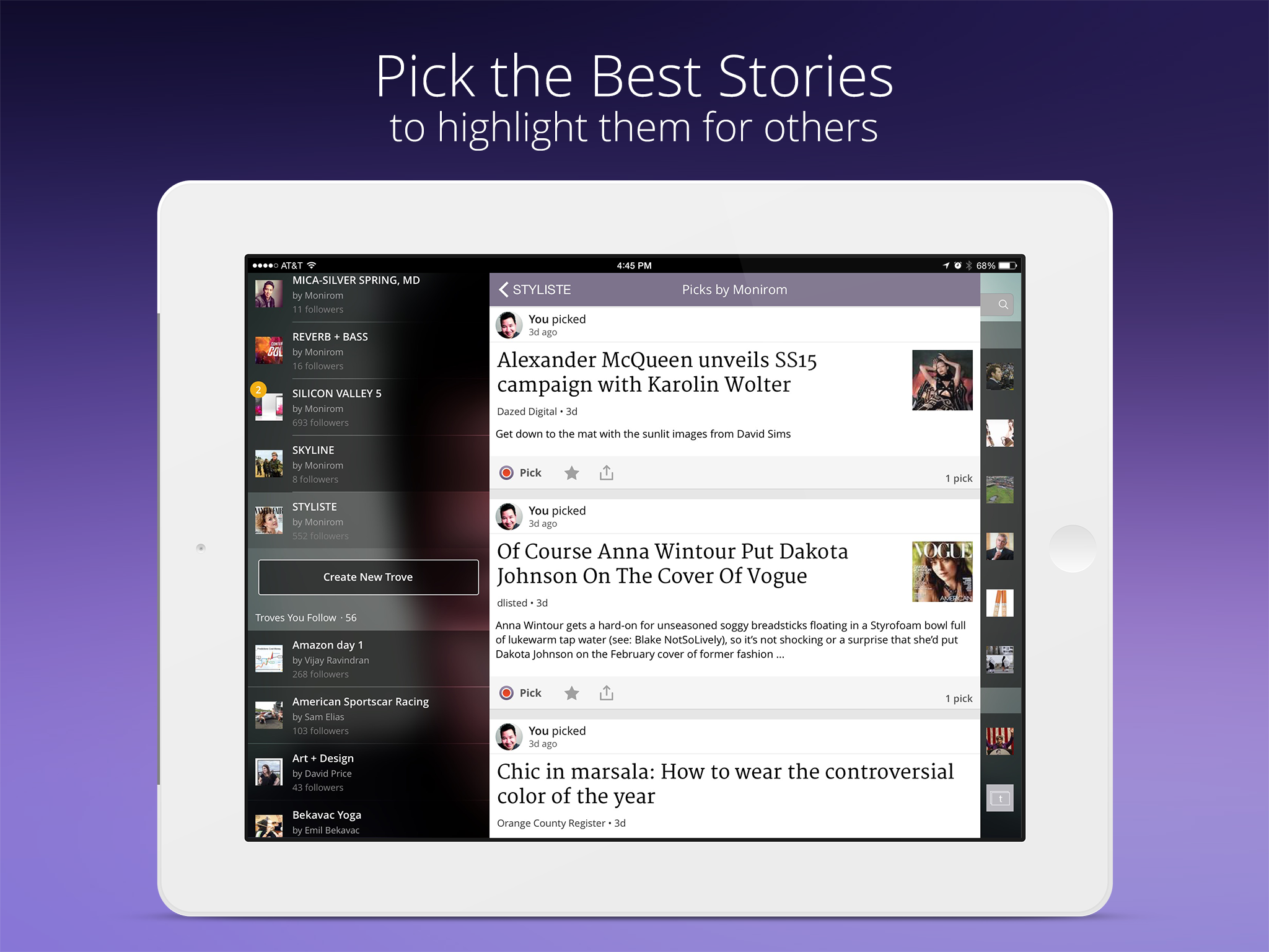
7. TROVE PICK FLOW (iOS)
The core action in the Trove product is the "pick", the act of a curator selecting a news article and adding it to their trove. We streamlined the pick flow within the respective iOS and Web apps but switched to the share sheet in later versions of iOS.


. . . . .
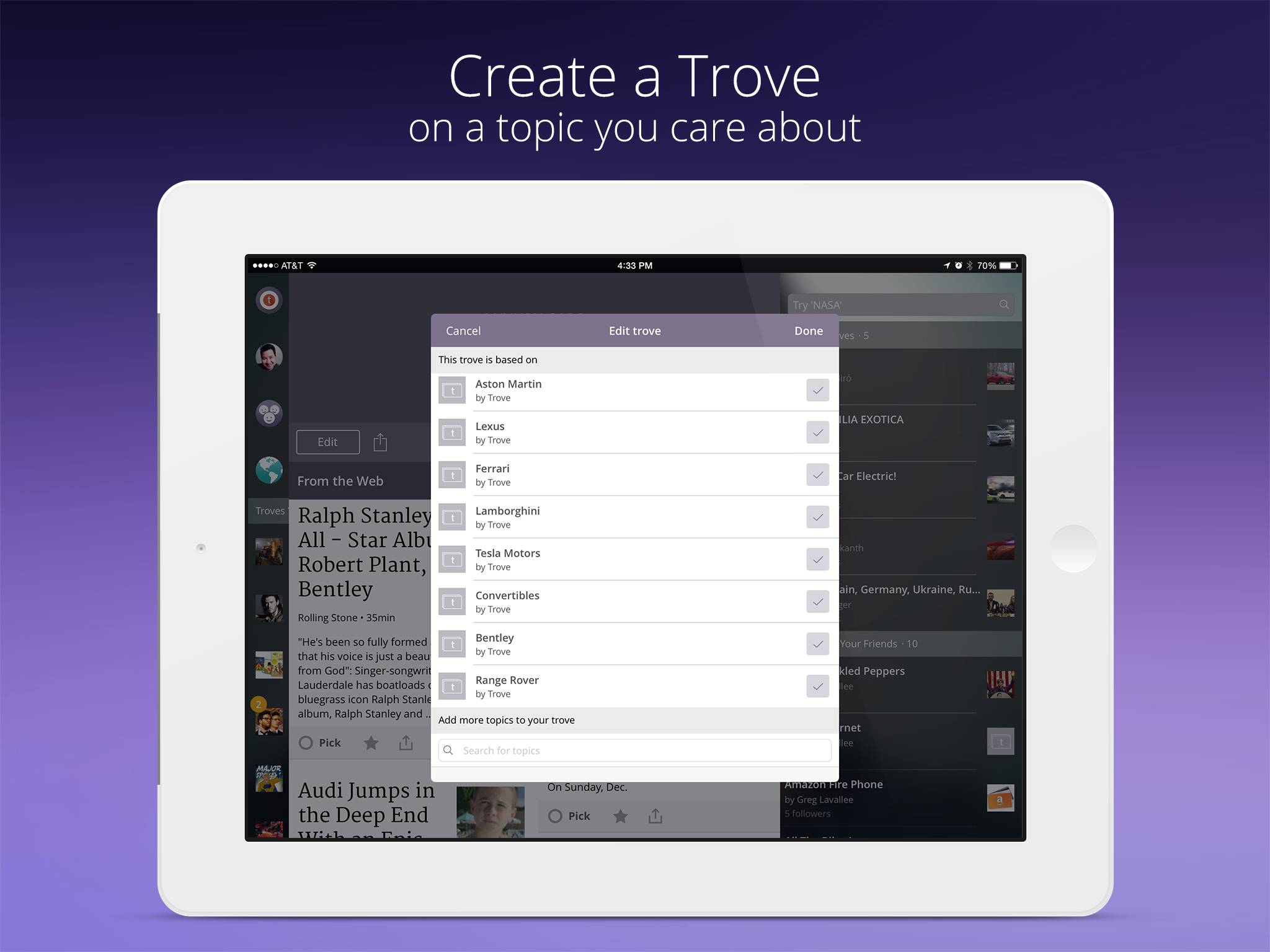
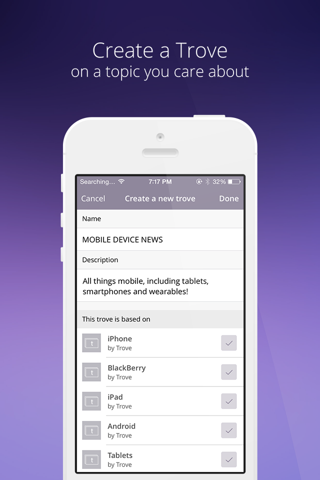
8. TROVE EDIT/CREATE FLOW (iOS)
The iOS platform was the first place we were able to give users real-time feedback. We showed them how their topic choices affected the news feed within the troves created. We would continue to iterate to make the experience fit in with the balance of the iOS UI. (The list stops at eight, not ten—because in reality, you don’t always get everything you wish for.)


TROVE BRAND UPDATE
We had a strong brand, but the visual realization of that brand needed standardization and a boost in color and contrast. This was especially true when used in reduction and in the context of avatars and app icons. I gave a presentation that adopted an updated logotype, color palette, and formal, minimal reproduction and graphic standards. Many trovers thought we should have chosen a different color besides purple. The problem wasn't color as much as our chosen hue and saturation level. Then again, we might have been ahead of the curve.
. . . . .


WHAT MADE TROVE DIFFERENT
The New York Times called Trove, “a treasure for news junkies.” CNBC explained, “It is as simple as creating a Pinterest board.” USA Today and The Today Show had also given us positive reviews. However, outside of the soundbites, Trove was much more.
Trove’s greatest power is the ability for anyone to start a trove on a topic, and lead the news for others. Trove’s topical algorithm constantly feeds story suggestions for curators to help them do this task easier than anywhere else on the web.
~ Vijay Ravindran, Trove CEO
Trove allowed curators to expand their reach farther and faster through the integration of content. Platforms such as Facebook, Twitter, and Instagram require users to do the heavy lifting of producing or introducing content to their respective networks. With Trove, all influencers needed to do was contextualize through a comment.
Users picked stories from our ecosystem of 90+ partners, 10,000+ vetted sources, and 43,000 feeds. This would have been a game-changer during the 2016 election — the year of fake news.
The beauty of Trove lay in the way users kept receiving news about topics they followed, even if a specific trove’s curator went on vacation or took a hiatus.
. . . . .


HOW OUR USERS SHAPED TROVE
Our users started to shape Trove in unexpected ways. Trove allowed you to create channels, aka troves, for topical interests that ran deep and were more relevant to you and your followers. Interests that would connect, entertain, or inform followers of your trove were more easily created.
The essence of Trove was picking news stories and providing the trove owner’s context. Many users saw this as an easy way to leverage Trove to help them become thought leaders in a chosen field or topic.
PR Agencies explored how Trove might be used as an alternative to Thomson Reuters Media Briefs and a way to monitor issues, brands, and competition for their clients.
Partner News Agencies looked at Trove as a possible white-label solution for their mobile apps.
Political Campaigns and Lobbying firms saw Trove as a way to monitor constituents. Parsing local news by zip codes during election cycles allowed them to track voter sentiment.
Graduate Students leveraged Trove as a research tool to inform their master theses.
For News Junkies, iCurrent’s algorithms and smart technology made it easy to curate a trove based on location, the topics, and the categories you defined.
For the Average User, Trove provided a way to easily manage the firehose of information on the Internet. You could choose what you wanted to read and tune out the pablum.
RESULTS: WEB APP
By the end of Q4 of my second year at Trove, we had revamped the HomePage to be more inviting to both new and returning users. Twitter ingestion and auto-troves were working, stars (curator feedback by upvoting), commenting / conversations were in use, and a rapidly improving discover experience was up and running. You can preview scrolling previews of the responsive home page in all three widths: wide, medium, and narrow.
An unvarnished look at all the views and use cases for the web app can be found here.
RESULTS: ANDROID + FIRE PHONE
Trove's Android experience started as a shim, and any improvements to the responsive web app would naturally migrate. Working with the dev team, we were able to translate certain browser-based actions off to native controls when it was logical.
We gauged user demand for Android support before building a pure native app. When the Amazon Fire Phone and Amazon Echo debuted, we took advantage of being among the first to exploit their respective new features.
On the Fire phone, it was Firefly, a tool that automatically recognizes text, sounds, and objects. It then offered a way to buy identified items through Amazon's online store.
On the Amazon Echo, Alexa could read the daily top headlines from Trove.
Trove for Fire phone seamlessly connected Trove’s active communities with Amazon’s user base through the Firefly plugin. When you used Firefly to scan something, you’d see Trove results, including news articles and troves. While you shopped, reviewed, and shared with your Amazon Fire phone, you could read more about your topic of interest, including what Trove’s curators suggest for their followers.
RESULTS: iOS
Web app improvements were migrated to the iOS experience when they proved their value to the UX.
We moved away from the hamburger and dual left/right menus. Originally meant to expose more content, it created more visual clutter and introduced the paradox of choice.
A streamlined tab menu that highlighted the Trove app's core actions replaced the hamburger menu.
We repurposed a "peek" state as a dedicated view for conversations and the metadata of that respective trove.
User's profiles and the troves they curated were given distinct treatments to differentiate them from news sources. e.g. (Chris Droukas' Cooking trove vs. the Bon Appétit trove).
We consolidated edit controls into a single primary screen.
We deployed large images throughout the main story feeds. We stopped differentiating between hosted and un-hosted articles — since our users never picked up on the visual cues. (Hosted articles lived in our app; unhosted articles were displayed using their native web views.)
iOS Metrics (MoM for troves curated by users)
43% Increase in Monthly Unique Visitors
19% Increase in Visits
57% Increase in Page Views
32 % Increase in Pages Viewed per Visit
Having inherited two diverse user experiences, we rectified this dissonance, and the iPhone and iPad experiences were truly in sync for the first time since I joined Trove. This laid the groundwork for a possible frictionless redesign.
Here's an unvarnished look at all the views and use cases for the last release of the iPad app.
CONCLUSION
With 45 days left in Q4, we were 300 shy of our target of 10,000 actively curated troves. For us to meet our target, new and existing users had only to create 10 new troves a day for the next 30 days. It was one of many goals we needed to meet, but one of the most important KPIs. Our goal was achievable.
Based on available data, the increase in new troves created by users month over month for all platforms:
104% Web App
41% iOS
36% Android (Shim)
95% Total
LESSONS LEARNED
People won't always use your product in the exact way you intended.
These users should not be punished if they find alternative or novel ways to leverage your product. They should be celebrated.
Onboarding remains one of the most challenging and vital parts of any product experience.
You can't skimp on opportunities to educate your users; this effort must be ongoing. FAQs and contextual tips aren't enough, and they're not the best way to teach your audience how to use your product.
No matter how intuitive your product is, educating new and existing users remains paramount as you add features.
Pixels aren't precious. It's better to deploy an ugly solution now than wait for perfection.
These lessons informed the newly redesigned experience we could have launched the following year—an app, aka Trove Redux.