ENGADGET iOS + ANDROID APPS
WHERE DOES HE GET ALL THOSE WONDERFUL TOYS?
BACKGROUND
Engadget is a multilingual technology blog network that covers gadgets and consumer electronics daily. It operates ten blogs—four in English and six international versions—each with its own independent editorial staff. Engadget ranks among the top five in the Technorati Top 100 and was noted in Time Magazine as one of the best blogs of 2010.
Engadget has 10.4 million unique visitors monthly and 41 million page views. More than 55% of Engadget visitors read it on their mobile devices.
my role: Head of Product UX-UI and Design
platforms: Phone and Tablet for iOS and Android
tools-processes: Analytics Review, Market Research, Collaborative White boarding.

THE CHALLENGE
Engadget asked, "Can you give our readers a real reason to download the iOS and Android apps?"
The Mobile Group replied, "Yes. Yes, we can." Pure download numbers were incomplete benchmarks. The uptick in engagement time was the real milestone. The challenge was hard enough without the new features and options requested. Which included, but was not limited to:
Integrating the review platform and databases of newly acquired gdgt.com
Support for all six foreign language editions is available within the same app.
Introduce real value to the app that would make readers want to download it vs. using the website.
On iOS, combine the code bases of the iPhone and iPad apps into a universal release.
We did this during a period of significant change. We onboarded new executive editors, and we were in the midst of rebranding. We migrated to a new CDN, and the website was being redesigned on a new CMS. We accommodated last-minute, radical changes in both the iOS and Android operating systems, which changed our original design.
We also had to meet the precepts governing our mobile web and apps.
Support the current OS and the last two major iterations of the OS.
Allow the user to use their device in both portrait and landscape orientations.
Allow for feature degradation across devices/foreign language editions.
Design for the platform not, for aesthetic continuity, i.e. don't port iOS designs to Android.

Fans love Engadget because of the obsessive focus on consumer technology; which is reflected in the tone and content of its articles, podcasts, videos and events.
RESEARCH FINDINGS
Working off seven years of collected data, we knew our core audience is primarily male. They're early adopters and gadget freaks, and they have income reserved especially for consumer technology. They're very vocal about their wants, needs, and desires. They like to discuss the gadgets they love and the gadgets they love to hate. They will analyze every bit of technology-based minutia.
Commuting readers liked to skim the day’s latest stories on their phones. Our evening and weekend readers wanted to use a tablet for more of a lean-back experience.
Everyone wanted to be able to comment within the app. Comments were half of the fun of Engadget.
THE WORK & ACTIONS TAKEN
After three years of working on multiple projects with Engadget, there was enough earned trust among stakeholders to allow me to radically redesign both the iOS and Android apps for both smartphones and tablets — with a minimal amount of oversight. It was to be a true redesign that bore the 3.O and 4.O version numbers for iOS and Android, respectively. Engadget wasn't afraid to try something new, we had provided the right motivation at the right time.
We pitched a new experience that streamlined the UX-UI. I championed a modular design that allowed for future flexibility. The idea was to build a system language that would be sustainable and allow me to save some of my sanity.
I designed everything as a brick.
It didn't belong in the design language or the asset framework if it couldn't be reused.
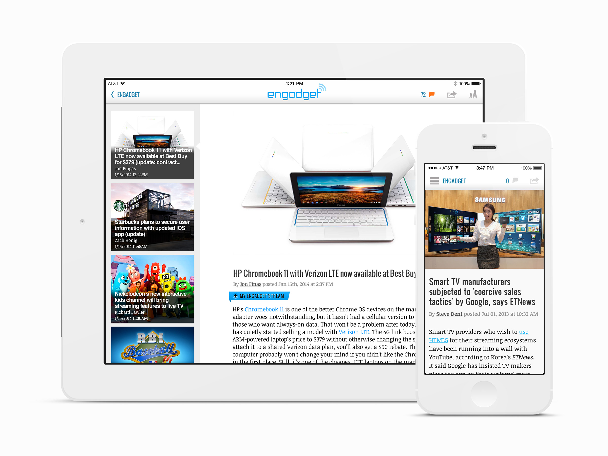
We got the green light based on key screen designs, a top-level wireframe/flow document, and a rigorous PRD. I designed a user experience that showcases content and minimizes application chrome. The phone app emphasized list views for commuters, and the tablet app utilized card views for lean-back readers. Because our readers are fickle, we allowed them to switch between grid and list views on the tablet. Instant downloads of articles were added for offline reading. We used our in-house solution, which performed better than Apple's share-sheet for social sharing. This allowed us to retain our shared data versus sharing it with Apple.
Over 500 separate pieces of documentation were meticulously generated and updated to keep multiple developers in multiple locations on the same page. The hybrid documents covered specifications, behavior, and design. There was a method to the madness, but today I'd just use Zeplin for design/developer hand-off.


As the sole designer for both the phone and tablet versions of iOS and Android, working smart was imperative. Bohemian Sketch was not yet popular as a tool for UX design, Zepelin didn't exist, and frameworks were still being developed for easy prototyping. Figma founders Dylan Field and Evan Wallace were still in the middle of their truncated years at Brown University. As pioneers, after Adobe sunset Fireworks, we made do with interactive PDFs and Apple's Keynote for prototyping.
I had to disrupt how we usually developed apps to speed up the process. We still had meetings and 1:1 collaboration, and tickets were filed in JIRA, but to ensure everyone was on the same page, I populated the in-house wiki last. I opted to deliver artwork, specs, and feedback using a coordinated combination of indexed Evernote notebooks and checklists, online repositories, and nightly summary e-mails.
Everybody got just what they needed, and they had a way of seeing how their work fit into the bigger picture that was more meaningful than a JIRA dashboard.
We shipped the first version of the new Engadget app with these highlighted features.
The left rail provides scrollable, adjustable navigation
The right rail houses media such as podcasts and videos
Double tap to get a chrome-less, full-screen experience
Support for Events and recurring Buyer's Guides
Expanded sharing options in the article views
Reading preferences such as font size adjustment
Download the entire day’s news with a single tap for offline reading
Swipe in list view to save locally or to Instapaper, Evernote, and Pocket
One-tap access to send Engadget news tips and app feedback for developers


RESULTS: iOS
Redesigning Engadget was a labor of love. I hewed closely to the corporate mantra that everything we made needed to inform, entertain, or connect our readers. I just disagreed that things had to be uber-simple to succeed. I knew if we kept the app simple but allowed for flexibility under the hood, we'd be able to make most everyone happy. Our final goal was to deliver the best user experience for short—and long-form content. (Preview this experience at iPhone and iPad widths.)


Making sure the reader had the most efficient UX did not mean we didn't spend a little time engineering delight.
(e.g. header animation during podcast playback.)
RESULTS: ANDROID
Whenever we release an iOS version, our readers always cry foul because Engadget has allegedly been biased in favor of a particular fruit company. Why not Android first? Truthfully, our resources were spread thin, and iOS was, at the time, a more manageable platform for us. I found on my team the right Android developer who agreed we should not do an iOS port. We would develop an original solution from scratch.
The Android app shipped with many of the same features as the iOS version of the Engadget app.


RESPONSE
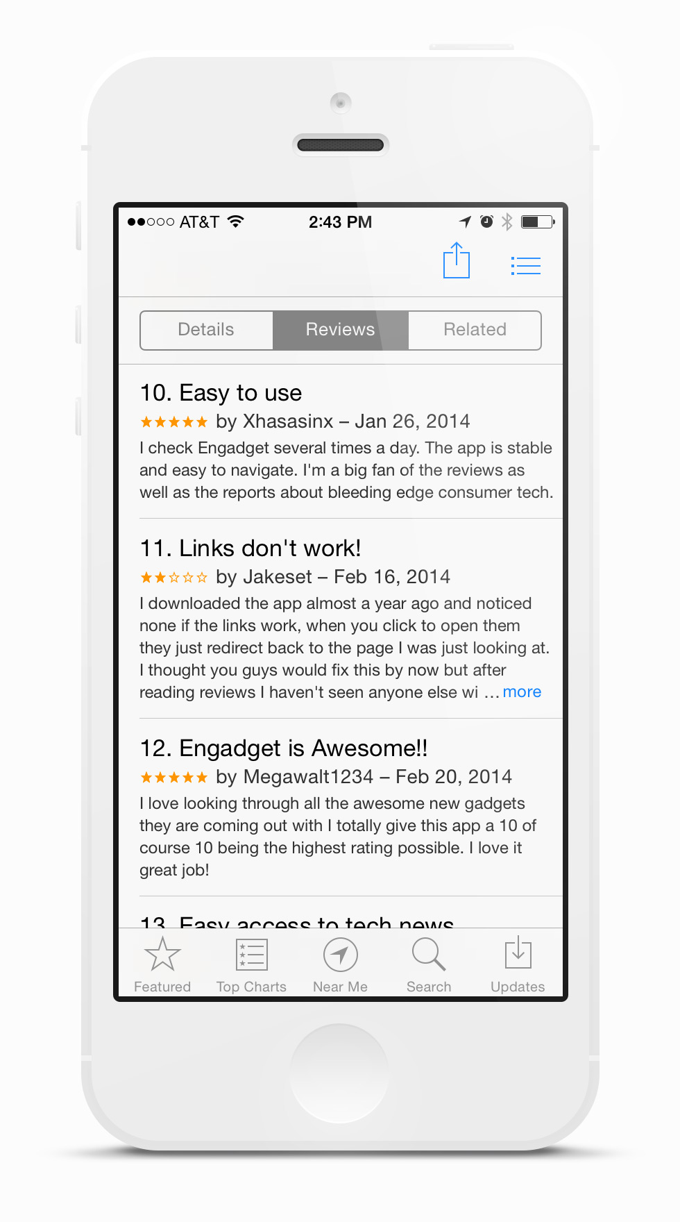
Engadget has a vocal and tech-savvy audience. They love to provide us with unfiltered feedback and unsolicited code. They write third-party plug-ins to hijack the website UX and post it on GitHub. Upon the launch of the new iPhone app, in true Engadget reader form, they told us they weren't pleased with the abrupt change. We were used to the gauntlet of bad reviews and let users vent. We responded to each concern in an unprecedented, ad hoc 1:1 campaign via feedback forms, emails, and comments on the launch article. After they realized many of their pet peeves weren't always part of the Engadget app, cooler heads prevailed. This was especially true of users critiquing new patterns in iOS 7 and iOS 8.
The positive reviews slowly rolled in. After 30 days, our app store rating started climbing, and we hit a perfect 5-star rating before reality returned us to 4.5 stars — after 300+ reviews within 90 days.
We focused on the Android app before returning to the iPad experience. Leveraging past miscues and lessons learned, we designed, developed, and shipped a universal iOS app in time for the release of iOS 8. Our year-to-date downloads climbed quickly, and our all-time combined downloads shot past 3.2 million. We saw a significant uptick in page views, visits, and unique views, but the real benchmark was engagement time. In-app engagement time, based on available data, increased by 30 percent.


EPILOGUE
Chromeless, fullscreen mode for articles was a favorite feature that many turned on and off by accident. These actions taught me that users don't always read alerts/notifications.
Offline reading was also a winner. Despite our belief that a dedicated edit system would be needed to purge downloads, readers understood the simplicity of what we deployed. They realized that every time you downloaded a full day's worth of articles, the previous download gets automatically purged.
These are not the only things I designed for Engadget, but they are the apps of which I'm most proud.
Engadget for iPad, the comprehensive screens via Google Photos (for completionists)
Engadget operates a total of ten blogs — four written in English and six international versions with independent editorial staff.