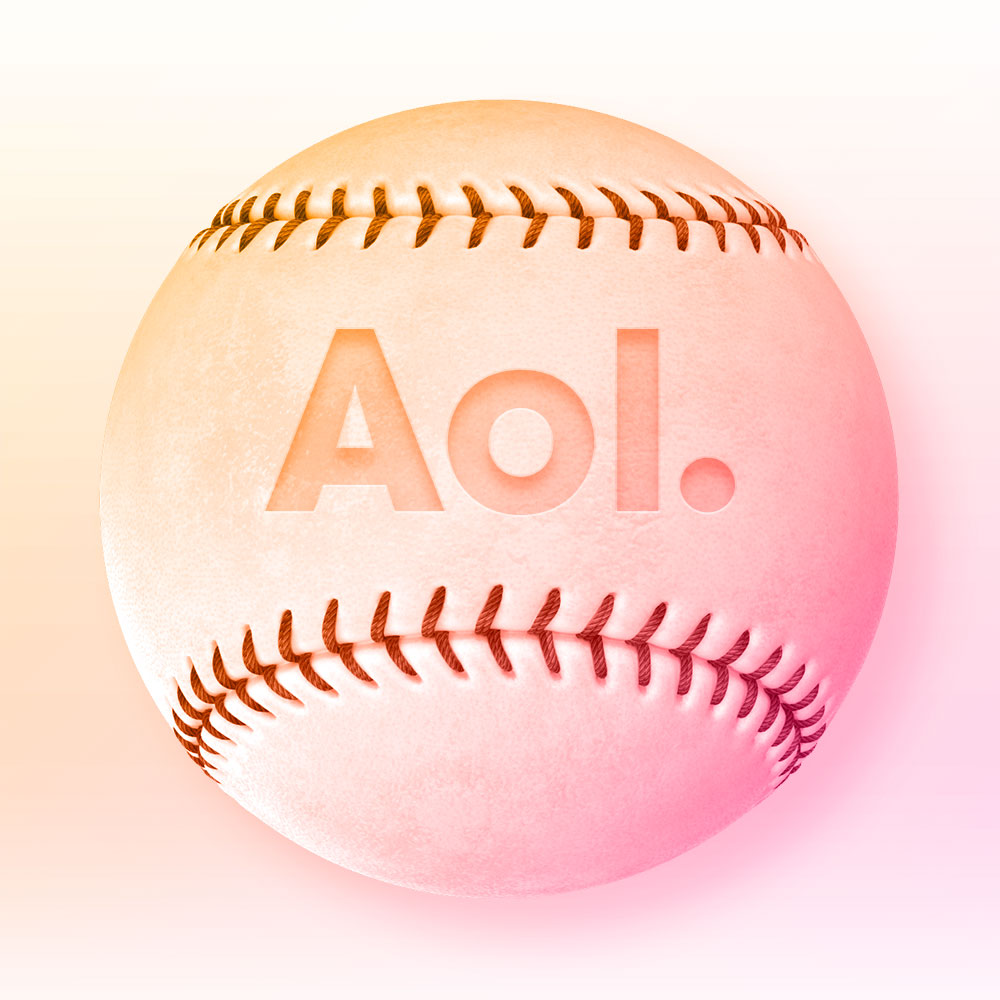
t.AOL.COM aka PROJECT BASEBALL
CARD & RESPONSIVE UX BEFORE IT WAS UBIQUITOUS
BACKGROUND
In the nascent days of smartphones and tablets, my fellow UX designer Jim Sabia and I conceived a way to simplify website mobilization. I was inspired by the debut of Japan's Infobar OS and the then-brand-new Microsoft Metro interface. Our challenge was figuring out how to make it work within a mobile browser.
. . . . .
We conceived, designed, and deployed a card-centric, browser-based framework for building websites — a full year before responsive websites and card-based design became the norm.
. . . . .
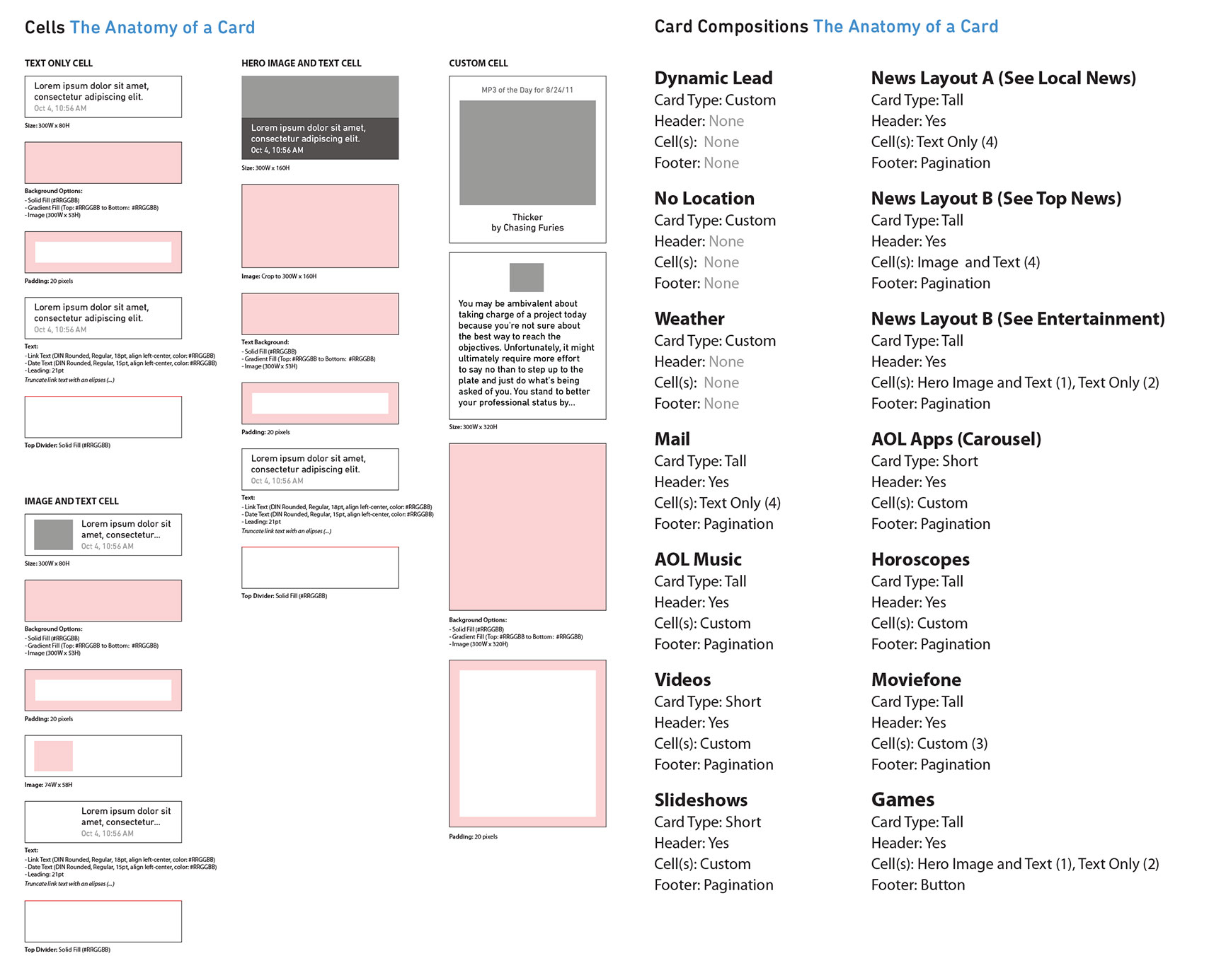
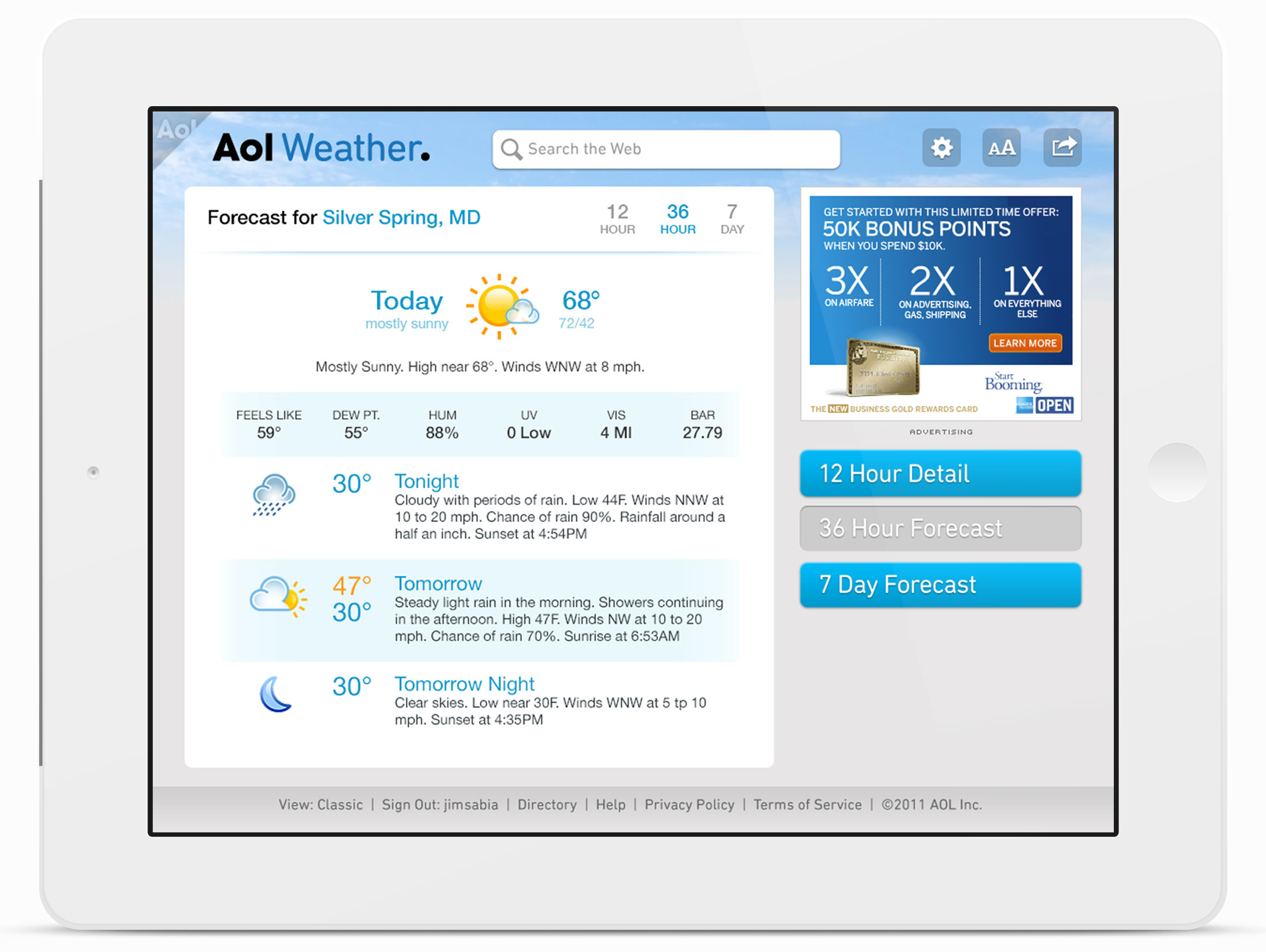
We designed and deployed a system that let us simultaneously build for narrow, medium, and wide widths. We designed cards for audio playback, video playback, photo galleries, news, weather, mail, and other custom content. The benefits of a card-based system were so obvious that we wondered why we and the rest of the world didn't think of it sooner.
Twitter and Google would roll out their own card experiences in late 2012.
my role: Product Design, UX-UI
platforms: Phone and Tablet for iOS and Android. Degradation for Blackberry & Feature Phone
tools-processes: Analytics Review, Market Research, Collaborative Whiteboarding.
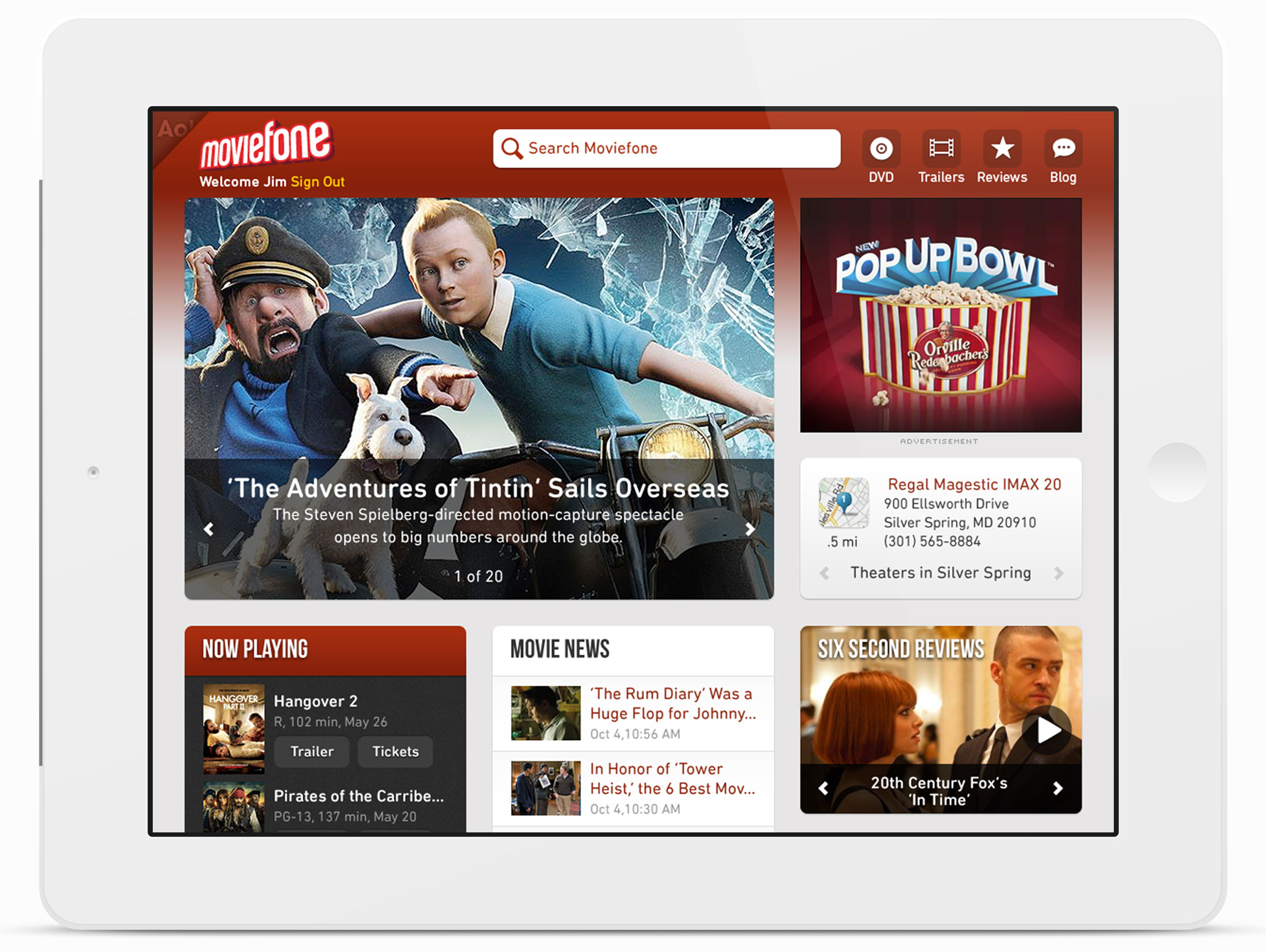
Inspiration came from the way information was displayed on baseball cards, thus the name Project Baseball.
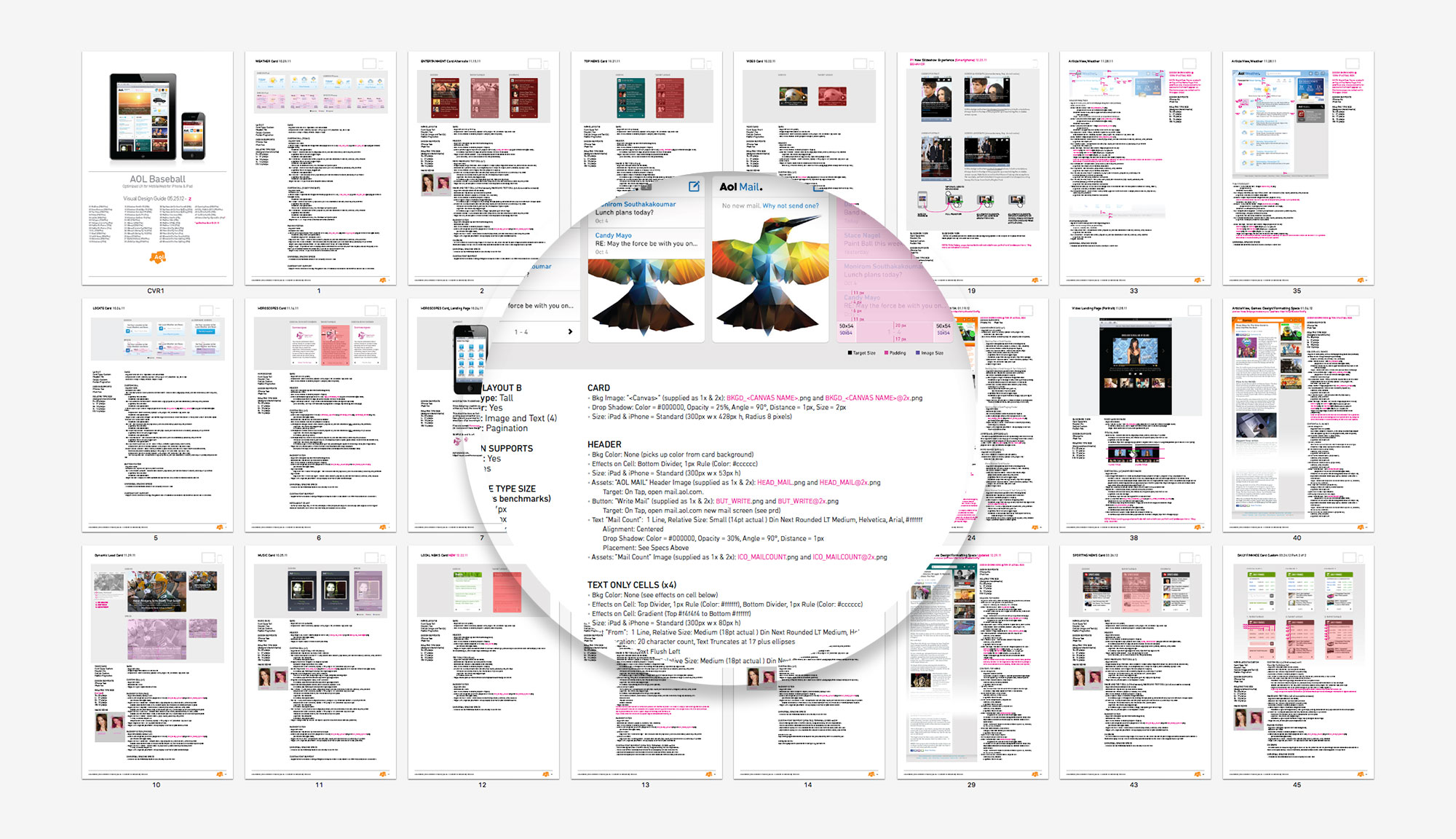
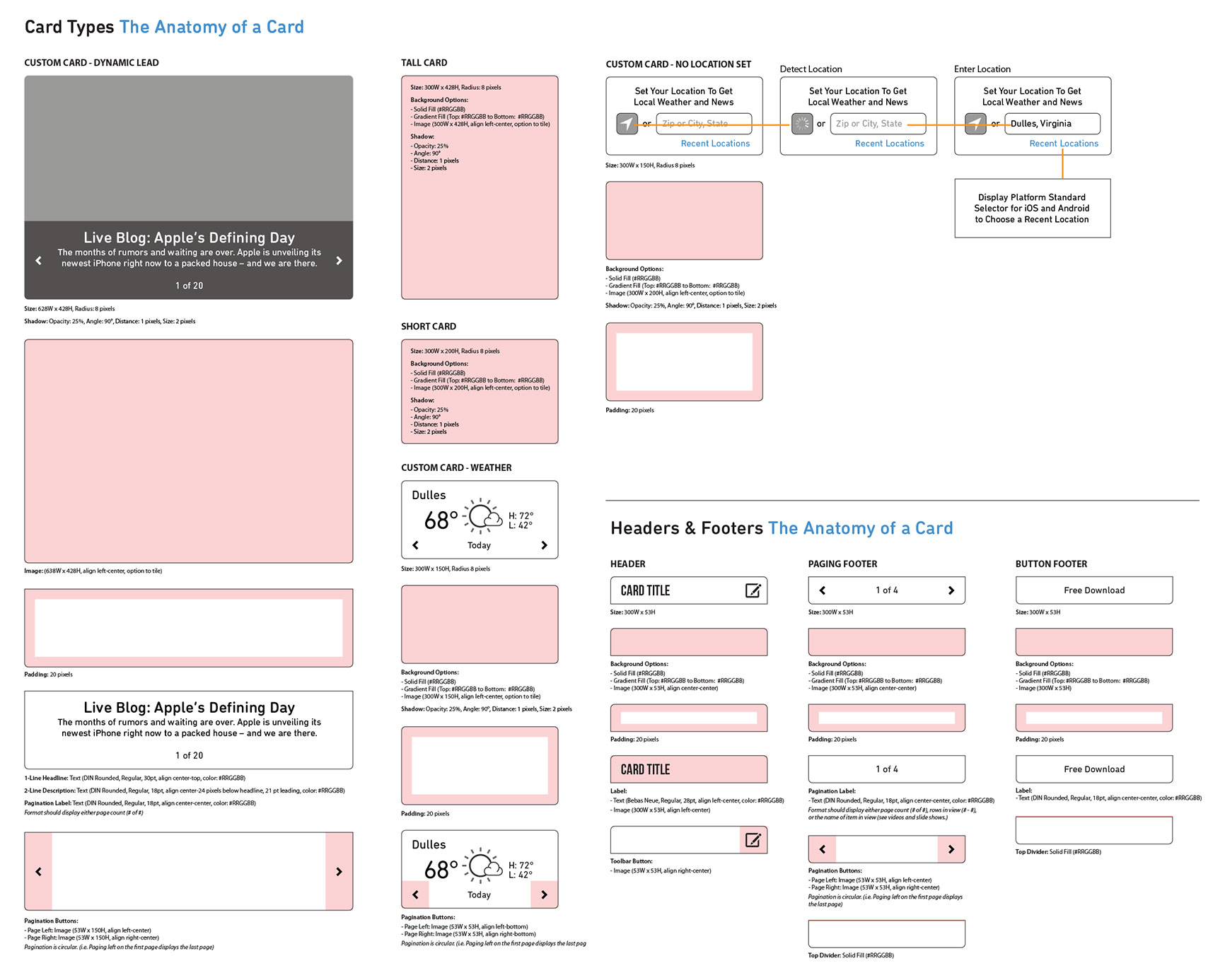
ANATOMY of a CARD
Because we designed Project Baseball’s components to work as independent cards, the ability to support signed-in/out states, location known and unknown states, and general customization was only limited to a specific brand's desires. The individual brands could mix and match cards as they saw fit based on their specific needs.
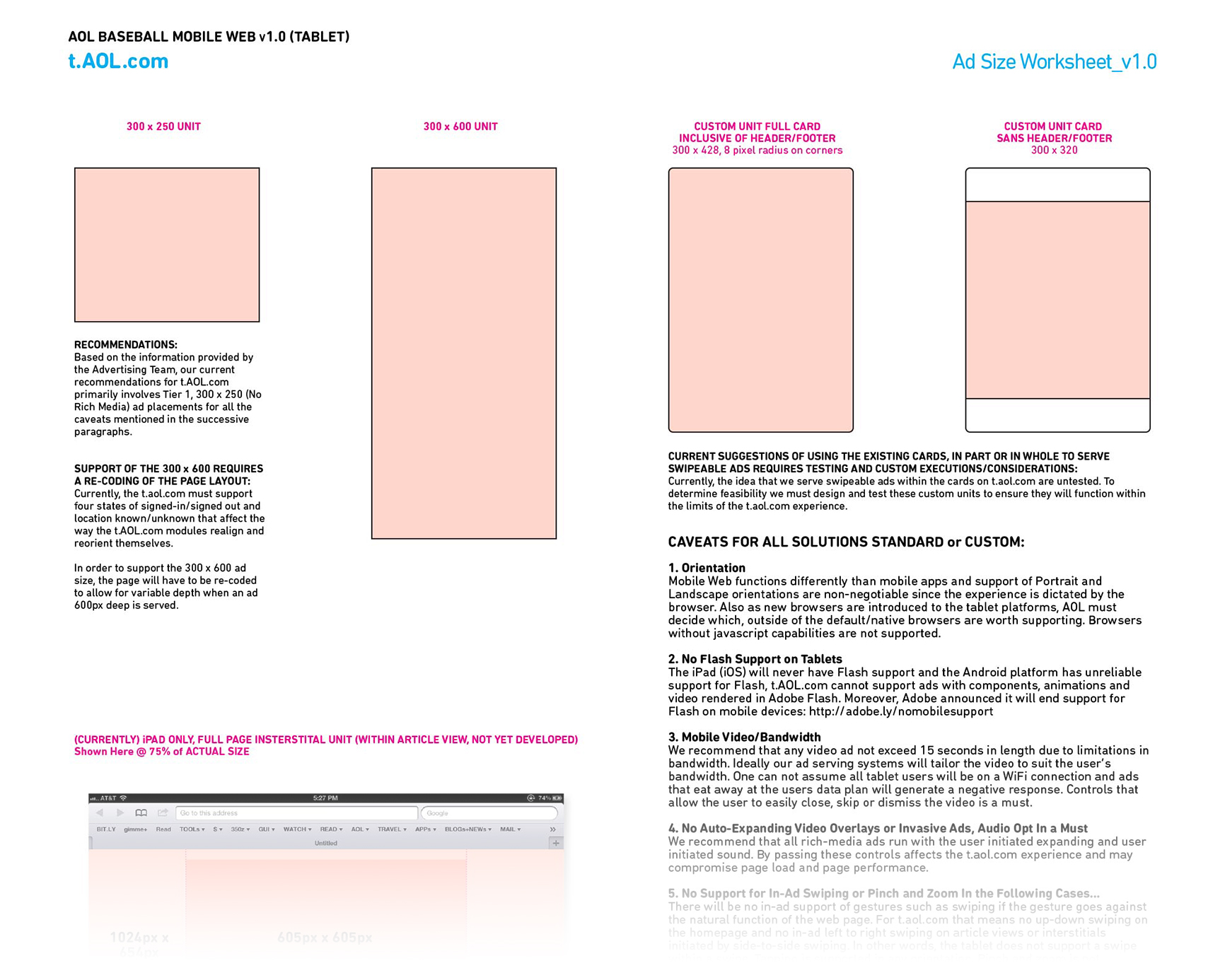
The Aol.com properties were monetized platforms, so we had to ensure that the design still worked with the ad units we were selling. Ad size considerations were addressed for landscape and portrait orientations and all the respective widths/devices.
RAPID DESIGN & DEPLOYMENT
With the help of our developers, who were equally enthusiastic about the prospects for this design, we were up and running within a single summer. We first deployed the solution on the Aol.com portal, but it was obvious how easily the design could be white-labeled and customized.
The design and development of any new features or cards would benefit all the brands in Aol's portfolio. The mantra of a rising tide lifts all boats won us internal support and the needed momentum to see the project come to fruition.
. . . . .
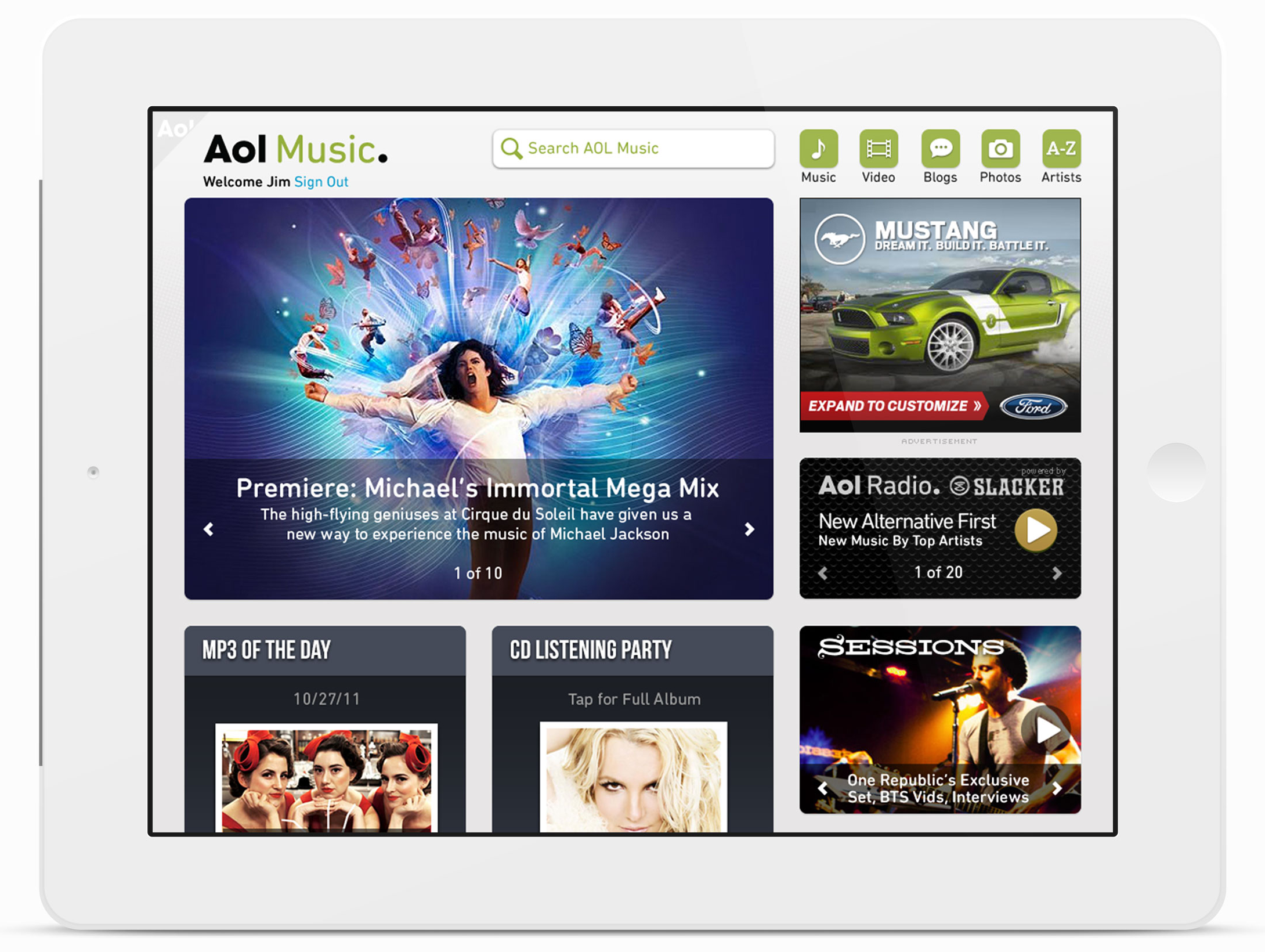
Our card designs for Project Baseball would evolve. The skeuomorphic design gave way to flatter, simpler, cleaner and more focused cards. It was obvious how easily the design could be white labeled and customized for specific brands.
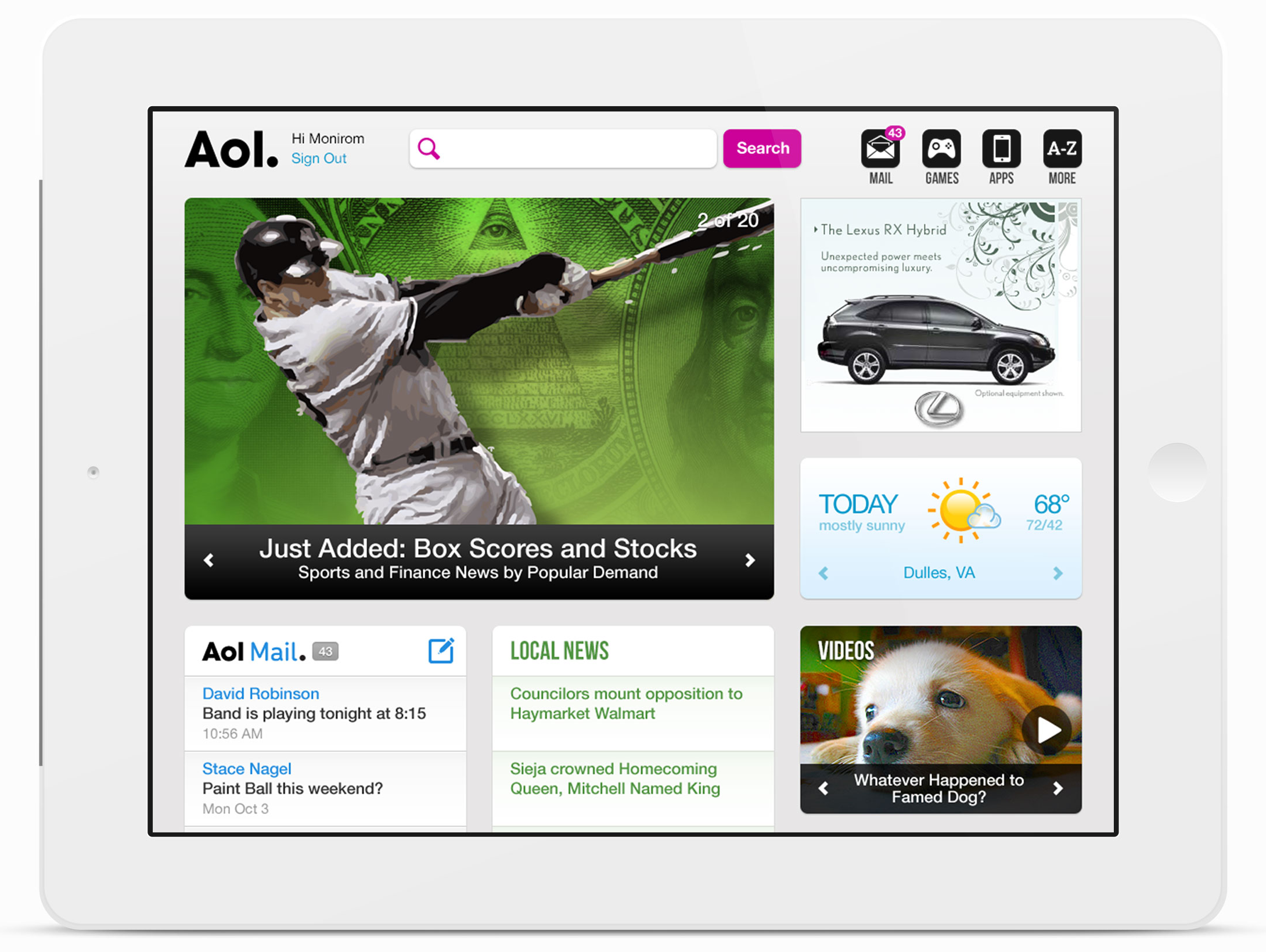
AOL.com has 7.2 million daily unique visitors and 21.1 million monthly unique visitors. The Site's homepage attracts more than 806 million page views each month. On average, AOL.com's readers visit the site twenty times a month.
USER REACTION & RESPONSE
Overall, participants liked seeing new energy in the t.Aol.com (Project Baseball) site design. The majority of people felt that the old design did not create enough differentiation between sections of content on the site.
In the Project Baseball version, branded headings made the site more stimulating. Several people mentioned feeling “happy” to be on the page because of the color. It didn’t matter whether people saw the mobile site first and then proceeded through the tablet and older desktop designs or if they reviewed the sites in reverse. (At this time Aol still maintained a dedicated desktop-centric website.)
Participants preferred the new Project Baseball mobile site to the old site. For half of the participants, the center column of the old site was confusing. These people were unsure what the content was, and they needed more help to contextualize the content. Compared to the old site, the Project Baseball execution was more modern, easily scannable, and emphasized data important to users. It also introduced music, video, and photos in a more tactile experience—one that heavily leveraged mobile gestures.
In reviewing the Project Baseball designs, participants wanted to be able to customize the content they saw on the site and to choose in what order said content appears. The ability to turn off elements that were not relevant to them personally was necessary. For some, it was the stock ticker, and for others, it was the games module. All these customization requests validated our thinking. We knew what the next steps could be, and overall, Project Baseball had been berry good to me.
VERIZON COMES KNOCKING
After launch, I was asked to explore how we'd adapt the new experience for a potential partner. That partner turned out to be Verizon Wireless. Verizon didn't want to maintain its customer portal and saw a co-branded experience as a possible solution.
The request required a 99.99% uptime, accommodations for legacy users versus new users, support for both Bing and Google search engines, mobile browsers, and legacy device support. This meant we had to support experience degradation across all devices.
Degradation in web design occurs when unsupported features are systematically removed from the users' experience based on the type of device. Rather than getting a notification that a feature wasn't supported, users wouldn't see it at all. As the SME for mobile web and the primary designer for Aol.com's mobile web, I'd already designed these experiences for Blackberry, Palm, and Feature Phone devices.
I like to think that this helped us in future talks and contributed, in some small way, to Verizon's eventual acquisition of Aol.
Degradation in web design is when unsupported features are systematically removed from the users' experience based on the type of device.