TECHCRUNCH + CRUNCHBASE
TECHNOLOGY: THE GREAT GROWLING ENGINE OF CHANGE
BACKGROUND
TechCrunch is the source for breaking technology industry news. TechCrunch covers businesses ranging from startups to established firms. Notable journalists and contributors include venture capitalists Chris Dixon and entrepreneurs Justin Kan and Kevin Rose. A must-read for Silicon Valley. TechCrunch garners 8,4 million monthly uniques and has 13 million followers who generate 26 million monthly page views. More than 50% of the readership reads TechCrunch on mobile devices.
The readership is made up of genuine tech news junkies.
19% consider themselves influential
44% earn an annual household income of $110K+
They're not just interested in breaking news. They also value the backstory — the enterprises, people, and products behind the news.
TechCrunch also operates CrunchBase, a startup ecosystem database. Consisting of investors, incubators, and start-ups, CrunchBase comprises approximately 500,000 data points profiling companies, people, funds, funding, and events. CrunchBase has more than 50,000 active contributors.
Members of the public, subject to registration, can submit to the database; however, all changes are reviewed by a moderator before being accepted. Editors review data to ensure it is up to date. CrunchBase has 1.2 million unique users accessing its database each month and 6 million monthly page views. This number grew exponentially after they entered into a partnership with Angel List. More than 30% of CrunchBase visitors use it on their mobile devices.
MY ROLE
Initially, I served as the visual design consultant and UX logic sounding board to Jim Sabia, the first Webby award-winning TechCrunch mobile app designer. I continued the work after Jim departed to work on Smartfood, a precursor to Project Baseball, a concept we had pitched to Aol Mobile’s senior staff. I was to solve the design problems that come with a raised profile, expansion of international events, further integration of CrunchBase, and addition of new features.
my role: Product, UX-UI, Design, Iconography, and Illustration
platforms: Phone and Tablet for iOS, Android, and mobile web (on CrunchBase)
tools-processes: Analytics Review, Collaborative Whiteboarding
Through news coverage, global events and its awards show the Crunchies, TechCrunch helps define the tech sector. The Crunchies is TechCrunch's premiere award ceremony to recognize and celebrate the most compelling startups, internet, and technology innovations of the year.
THE CHALLENGE
The original challenge was to design an app for TechCrunch that let them evolve with their audience in the move to mobile platforms. The move allowed them to capitalize on their own content instead of relinquishing it to third-party readers like Flipboard and Pulse.
The secondary challenge was to maintain momentum as new features were added and underutilized features sunset across both iOS and Android apps.
Implementing an advertising strategy was part of this challenge. To do this, we’d need to weather the constant shifts and changes on TechCrunch’s mobile web and desktop platforms, including CrunchBase.
THE WORK & ACTIONS TAKEN
As our monitoring identified sections and features in the apps that were underutilized, they were systematically streamlined or replaced.
The top right rail banners were minimized. The animation was distracting to readers. We leveraged this distraction and space on an as-needed basis to announce TechCrunch events. Later builds would use the same space for advertising. We eventually revisited the module after app reviews complained about “flashing ads.”
Banner advertising was also introduced to the chagrin of our readers. A necessary evil, I preserved the reading experience by advocating for no ads in the article view, only in the river views.
I performed triage by also designing CrunchBase.com v1.0 for mobile web to replicate the features already present in the apps. This bought them the time needed to design, build, and launch the responsive version of CrunchBase. Additionally, this would feed our UX-UI improvements in the “explore” section of the mobile apps.
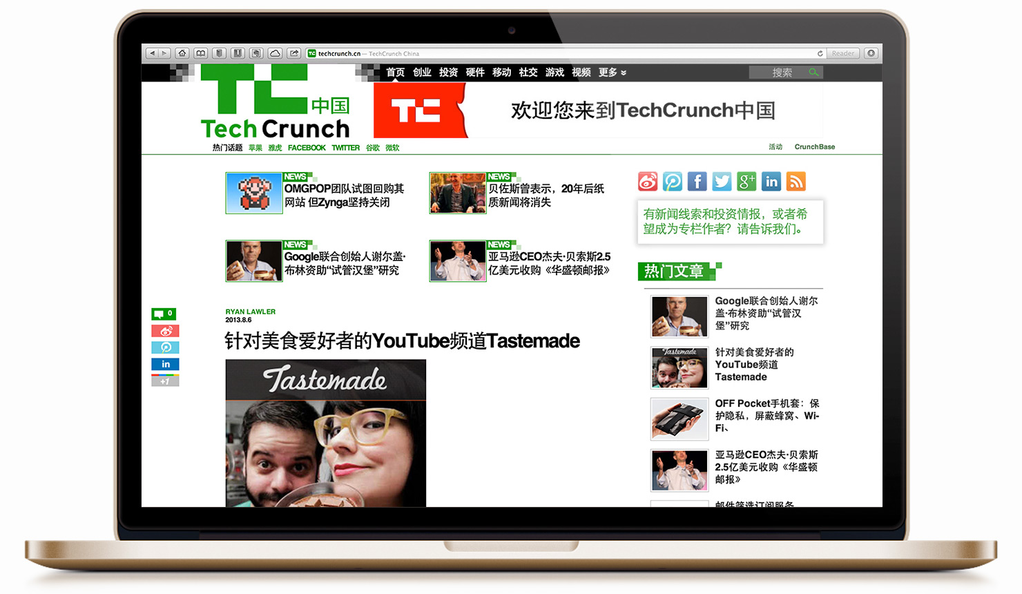
Our Chinese audience was growing, and overseas events also needed to be incorporated into our experience. I took the opportunity to design and develop the Events section of the Chinese edition of the TechCrunch website. The foreign language editions were meant to dovetail into future releases of the mobile apps.
. . . . .
First on the list was some brand house cleaning. Minimal reproduction specifications and standards and asset repositories were created and posted online to minimize the propagation of unofficial icons, logos and, colors.
TECHCRUNCH EVENTS CHINA (Web)
I provided the design and specs for Events on the TechCrunch China site (view scrolling mocks)
CRUNCHBASE (Mobile Web)
m.CrunchBase.com was designed and deployed in under ten days. It shared visual cues with the CrunchBase UX within the TechCrunch app (view scrolling mocks) and was launched as a stop-gap solution for the now responsive CrunchBase.com site.
Success in Silicon Valley, most would agree, is more merit-driven than almost any other place in the world. It doesn't matter how old you are, what sex you are, what politics you support or what color you are. If your idea rocks and you can execute, you can change the world and/or get really, stinking rich.”
~ Michael Arrington, Founder of TechCrunch
TECHCRUNCH iOS
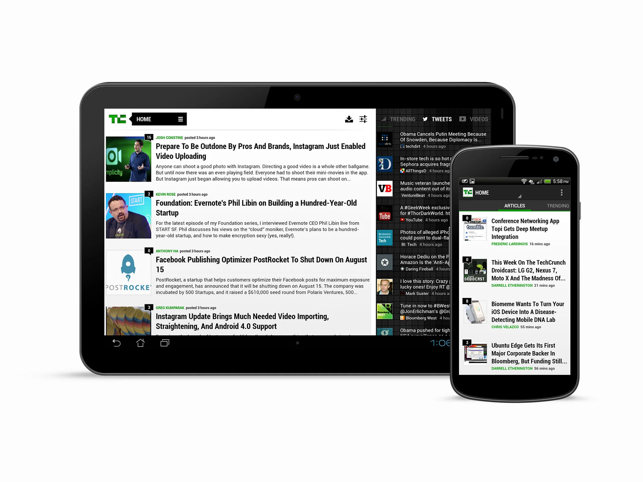
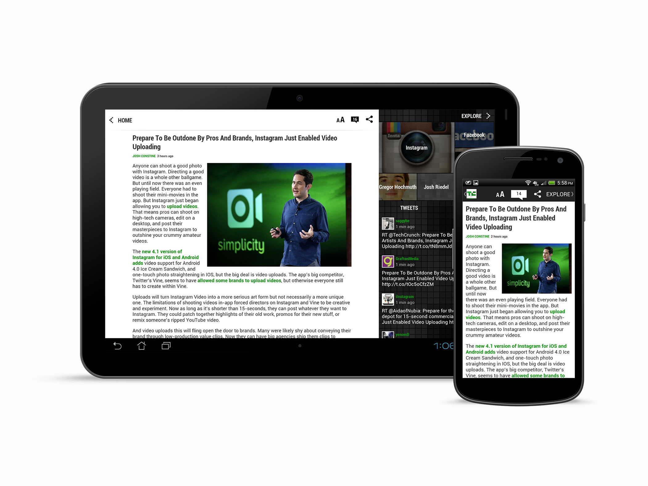
During my time working on the app, multiple builds of TechCrunch for iOS were released, with the most significant design changes occurring in the CrunchBase and Explore sections.
TECHCRUNCH ANDROID
Changes made for iOS would also be mirrored on Android.
RESULTS
When the apps launched in their initial version, v1.O, we saw a 66% increase in page views, a 94% increase in visits, and a 51% increase in unique visitors. The mobile apps enabled TechCrunch to more readily monetize its content with co-branded sponsorship.
The original design framework was preserved to keep TechCrunch an optimized reading experience when adding new features and tweaking current ones. Many users expressed their preference for the mobile experience over the desktop-specific website.
We continued to give users in-app access to CrunchBase, allowing them to learn the back story of the people, companies, and technology they were reading about. I continued to fight to keep the prodigious white space in article views and find a balance between advertising and content.
We continued to make more tweaks during the time I worked on TechCrunch. We saw an uptick over the original numbers based on available data during that time. We saw an additional 52% increase in page views, a 70% increase in visits, and a 66% increase in unique visitors over a year.*
Our readership was increasingly mobile, and the data confirmed that this was the right platform for TechCrunch's expansion.
*Numbers only cover TechCrunch iOS and Android. Does not include mobile web properties or brands.
. . . . .
“For those working in the startup world, this is a daily must-read. TechCrunch does an amazing job covering the important stories and also those novel never previously told stories that pique your interest. The only complaint - some of the stories come across as simply reprints of PR campaigns. But they too are at times newsworthy.”
iOS App Store Review
. . . . .
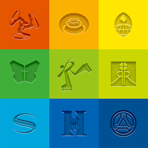
Designs for Digital Billboards
EPILOGUE
TechCrunch began to monetize its content on mobile effectively. One week after launch, the iOS app was rated the #1 news app on iTunes and won a Webby for the best news app. Readers gave us glowing reviews, and users rated TechCrunch five stars.


